Since the second installment of this series was a bit complex and abstract, even for me, I thought we might take a break and look at the difference between results among likely voters and registered voters. How much difference does it make?
At the end of the 2000 presidential race, three polling organizations released results among both likely voters and registered voters (that I could find). All three used a very similar method of selecting likely voter models.
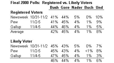
The results show the classic pattern. The Republican, Bush, did a few points better among likely voters than among registered voters. Again, since registered Republicans typically turn out at levels a few points higher than registered Democrats, this pattern was not unusual. Given the closeness of the race, this meant that Bush led by a few points among likely voters, but trailed or ran even among registered voters. The outcome of the election was, of course, somewhere in between: 47.9% for Bush, 48.4% for Gore and 2.7% for Nader (with the remaining 1% going to Buchanan and other candidates).
Posting these results begs the “BIG, BASIC question” that emailer Bill S asked this morning: “HOW did the various polling outfits do in 2000?” I am not sure we can find a definitive answer, but to let you be the judge, let’s look at the rest of the results among “likely voters” as defined by the pollsters:
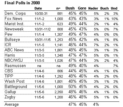
Before getting to Bill’s question, notice a few things. First, the average of all the likely voter results (47% Bush, 45% Gore) was not much different than the average likely voter result (46% Bush, 44% Gore) for the three organizations that released results among both likely and registered voters.
Second, notice the similarity across all the polls. Recall the lesson on sampling error from my very first post, and notice that every poll but one had Bush and Gore within the expected 3% of the average. For all the variation in polls during the 2000 race (and there was a lot of it), they converged at the end. (The exception was Rasmussen poll. According to a story quoted on this page, Scott Rasmussen came away from the experience convinced he had too many Republicans in his sample, and vowed to weight by party identification in the future so he would not be similarly off again).
Third, many point to these results as evidence that the likely voter models were wrong, since they typically had Bush ahead by a few points, and of course, the result was essentially a 48% to 48% tie. I’m not persuaded for two reasons: First, Most of the polls were conducted over the final weekend, although a few were done as much as a week before the election. Over the final weekend, four of the five daily tracking surveys charted by the Polling Report (Gallup, Zogby, Battleground and TIPP) showed Gore gaining ground. Second, most of the surveys gave Ralph Nader more support (4% on average) than he received on Election Day (2.7%). Presumably, some Nader supporters switched to Gore at the last moment when the final polls showed that Gore closing on Bush.
The likely voter models may have been off a bit in Bush’s favor, but the results among registered voters (in the first table above) were off a bit in Gore’s favor. Reality may have been somewhere in between.
So which survey was best? I am not comfortable picking a single “winner.” Let’s remember sampling error. Once a survey gets to within a few points of reality, the difference between getting it exactly right and missing by a point or two is pretty much random chance. The National Council on Public Polls calculated the error for ten of these surveys and found the Bush/Gore margin was within 1.5 percentage points for nine of ten surveys – all well within sampling error.
Finally, let’s go back to the difference between likely and registered voters. Are the likely voter models showing the usual pattern of a slight advantage for the Republican candidate? The following table shows results for eight organizations that have released results for registered and likely voters over the last two weeks.
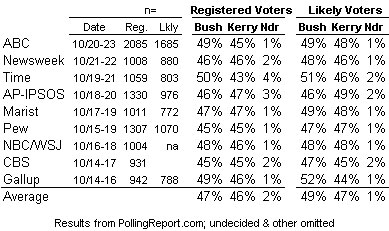
Oddly, the results do not following the usual pattern. On four surveys (Gallup, Newsweek, CBS and Marist) Bush runs at least a point or two better among likely voters. However, on four different surveys (ABC, Time, AP-IPSOS, and NBC) Kerry does at least a point better among likely voters. On the Pew survey, there was no difference.
Why? I’m not sure I know the answer, and I know at least some of the pollsters who produced these results are puzzled too. Perhaps we can find some answers in the different ways these organizations define likely voters. But don’t count on it.
I am tired of correcting intelligent people on this point. ‘Beg the question’ does not mean to raise or avoid the question. It is a term of logic that means to take for granted or assume the thing that you are setting out to prove. Circular reasoning is typical of “begging the question.”
Although Mr. Thomas is correct, regarding the original meaning of “beg the question.” Mr. Blumenthal’s use of the term is now accepted according to the New Oxford Dictionary of English.
So, Mr. Thomas get some rest. You no longer have to be tired. No reason to correct intelligent people anymore.
The pollsters did terribly in 2002. I took RealClearPolitics’ final page and compared it to the actual election results here:
http://cellar.org/showthread.php?t=2599
Zogby was most quoted pollster and he was “wrong” on 7 out of 9 elections. Note that I am a compleat amateur at this sort of thing, just a news-hound.
No longer a random sample
Maybe at one time, the lack of screening technology, and the telephone etiquette prevalent among Americans, made samples taken by telephone essentially random. But a generation of telemarketers has gotten us used to ruthlessly cutting off people on the other end of the line, and various technologies let us screen who we choose to cut off, or to respond to over the phone. In light of these changes, I don’t see that the standard should be that a telephonic sample’s contact and cooperation biases are to be considered non-differential until proven guilty. If the subjects can control their inclusion in a sample, and have an interest in participating or not, it’s no longer random, and you have to assume that these subjects often decide to participate or not with the specific intention of adding differential bias.
While both sides might be expected to have an equal propensity “stand up and be counted” for their side, that is not clearly a reasonable assumption, nor is it safe to assume that both sides have equal access to the screening technology that allows subjects to selectively opt into answering Gallup, while screening out the telemarketer. The faith-based community might have an inherently greater propensity than the reality-based community to be white-hot zealous to register their votes in a poll, and might give untruthful answers about their past voting habits, specifically to avoid being weighted out or down in the number-crunching phase of poll production (and don’t doubt these people are incapable of that level of sophistication). This would explain both the likely/registered inversion noted above, and a tendency I have noted for Bush to get, admittedly small, upward bumps with no obvious reason discernible in the recent reality-based news, and in fact, in seeming reaction to bad news. They feel most in need of producing good faith-based news precisely when their cognitive fortress is most assailed by reality.
Easy enough to check this theory out. Take a poll after the election. If, in the poll, Bush outdoes his actual performance significantly, we’ll know the Self-Selected Blowhard on a Mission from God theory is correct. If he outdoes his actual performance especially among folks who claim to be otherwise lifelong Democrats, we’ll really know, and that we need to rename it the Self-Selected Mendacious Blowhard on a Mission from God theory.
I don’t have to accept it. The improper use of the term diminishes the proper use of the term. People will forget what is a useful and elagant meaning. One can easily use ‘raise’, ‘prompt’, or ‘avoid the question’ to more clearly make their point and not rob the language of a great term.
Petty squabbles over language aside :), what strikes me most about the 2000 data is this:
The Incumbent Rule, if applied to Gore, seemed to be turned on its head. Gore was behind in almost every one of these polls, and yet he came out just slightly better than even with Bush.
You would think that Gore would have gotten the wrong end of the stick on the Incumbent Rule, wouldn’t you?
A good article on pollingreport.com shows that in the cases where the Incumbent Rule didn’t apply (i.e. more or less equal split of the undecideds), the challenger was also well-known.
I think in 2000 that Gore was the much better known candidate, and that, though technically not the “incumbent,” should not have gotten those undecided voters — if the rule is correct in theory.
Maybe the DUI news in the last 10 days of the 2000 election had something to do with that late break for Gore?
Anthony,
Gore was not the incumbent President. Further, he was running against someone named “Goerge Bush,” the same name of someone who had been President only eight years earlier. No way does the incumbent rule apply in that situation. Panagakis’s orignal work on the subject actually coverd several cases of family name sakes, included Hubert Humphrey III. It voids the incumbent rule.
Primarily, it looks to me as if pollsters are not using large enough samples in these tight races. When the race runs within the margin of error for several weeks in a row, then your results are clearly useless until you increase your sample size. Pollsters should either lay out more cash to make about twice as many calls and drive down the margin of error–understandably something they don’t want to do–or else they’ll have to get used to the fact that they’ll develop a reputation for being wildly off-base and probably lose influence.
I don’t know how it is with internal campaign polling; I suspect that has to be more accurate to be useful already, as candidates need real assessments whereas news organizations only really care about some numbers they can write a story on.
Hiding behind the Margin of Error
There’s no sense increasing the number of subjects polled, in order to decrease your precision error, if your accuracy error is so large that the greater precision would be meaningless. The polls clearly have accuracy problems at least as big as the 3-5 point MOEs they shoot for in choosing their sample sizes. It would be a waste of effort to pump up the sample size just to more precisely state our ignorance. It could actually be dangerous to the continued salability of the product pollsters are marketing if our ignorance were more precisely defined. People have unrealistic expectations.
Chris: I see your point about the name coming in to play.
I believe that the Incumbent Rule, as a basic theory, could apply to non-incumbents as well, because it’s a referendum on something “well known” vs. something “less well known.” Incumbency is an obvious marker, but even for incumbents, the degree to which their constiuents “know” them probably varies quite a bit, and thus the incumbent rule should apply more or less strongly to them.
Maybe this is completely wrong. I don’t know. The exceptional cases in the pollingreport.com article would seem to support this line of thinking.
I think you’ve left out a very important point when comparing the 2000 polls to the final results:
The effects of the media calling the election early for Gore.
I followed the results closely on election night. What I heard was state after state being quickly called for Gore, and Bush states (like Ohio) being “too close to call”. Then the networks called Florida for Gore. Which told me, and anyone else who had been paying attention, that the election was over, and Gore had won.
How many people didn’t vote because of those calls? How many Bush “get out the vote” people gave up and went home? What change did that cause to the final vote totals?
I read a study on National Review Online that compared final margin of victory to how long it took the networks to call a state. What that study found was that Gore states were called consistently and significantly faster than Bush states, for the same margin of victory.
If you don’t think that had an effect, either you weren’t following the election closely that night, or your memory sucks.
Greg D: great point. I wonder if anyone has any links to information about how the networks plan to handle election-night calls differently this time around?
Are they going to gag themselves until 8PM PST?
From Tom Brokaw: concern, but no structural changes.
From a Washington Post article: CNN vows “prudence, caution and extreme diligence,”, but again I don’t see any structural changes, apart from vowing to absolutely not call a state until polls have closed in the whole state.
http://msnbc.msn.com/id/6215297/site/newsweek/
http://www.washingtonpost.com/ac2/wp-dyn/A25309-2004Oct11?language=printer
What constitutes a closed poll?
In Georgia, anyone in line at closing time will supposedly be allowed to vote. Based on registration and advance voting numbers this year, even in this non-battleground state, they expect the last votes to be cast some time after midnight. If the networks are using exit polls, I expect they will only wait until after legal closing time.
Thing is, the Incumbent Rule, as Mark keeps pointing out, isn’t just a rule of thumb. It’s a strong theory based strongly on the evidence available. The Expanded Incumbent Rule you propose quite demonstrably doesn’t work, based on the evidence available.
Why do you assume that this is necssarily a Gore advantage? If all of the early states were going Gore, it would be just as reasonable to predict that Gore supporters would feel unnecessary and stay home while Bush supporters would feel that they had to get every possible vote out to try to offset early advantages. Making guesses like this that aren’t based on any observed behavior may make Bush supporters feel better about losing the popular vote, but it doesn’t actually have bearing on reality.
Nick,
It is a constant claim that hearing that your candidate has lost makes you less likely to go to the polls (see, for ex. 1980, and the West Coast Democrats who bitterly complained about Carter conceeding before the CA polls had even closed).
It also stands to reason that hearing your candidate has lost gives you much less incentive to call a bunch of people and urge them to go out and vote for your candidate, let alone walk from door to door encouraging them to vote.
OTOH, if your guy has “won”, then you get the positive feeling of being on the winning team if you vote. If you’re part of a GOTV operation, and you “know” your guy has won, the effort of continuing seems much less, and the rewards seem greater (there’s going to be a victory party afterwards. You going to show up after flaking out on the work you said you’re going to do?).