Last week, the Gallup organization released a survey sponsored by CNN and USAToday, fielded February 4-6, that appeared to show a surge in President Bush’s job approval rating from 51% to 57% since mid-January. “The Iraqi elections…produced a bump in President Bush’s approval rating,” said CNN. “Americans gave President Bush his highest job approval rating in more than a year,” read USAToday.
Gallup immediately went into the field with a second poll conducted February 7-10 that showed the Bush job rating back down at 49%, “slightly below the levels measured in three January polls, and well below the 57% measured in Gallup’s Feb. 4-6 poll.” Unlike the first survey, this one was not co-sponsored with CNN and USAToday, and thus as blogger Steve Soto put it, this poll did not get “bull-horned through the media” the same way as the first.
As such, I want to consider the question Soto raised Monday on TheLeftCoaster: “How often is there a 16% swing in a public opinion poll in one week?”
The short answer is, not very.
But then I never seem satisfied with short answers, do I? Let’s take this one step at a time. First, a minor quibble: “shifts” in polling numbers always seem more dramatic when you compare the margins, or in this case the difference between the approval and disapproval ratings because doing so artificially doubles the rate of change. The February 4-6 survey showed 57% approving Bush’s performance, 40% disapproving (for a net +17). The second survey showed 49% approval and 48% disapproval (net +1). Thus, 17-1 = a 16 point shift. The problem – if this shift were real – is that it would have only involved about 8% of the population changing their opinion. That number is still quite large, and would certainly be outside the reported sampling errors for samples of 1,000 interviews, but does not sound quite as astounding as a “sixteen point shift.” Better to focus on the change in percentage expressing approval than the margin of approval minus disapproval.
Second, I might rephrase Steve’s question a bit: “How often do we see real shifts in presidential job approval of this magnitude?”
Rarely. That answer is evident in the remarkable graphic maintained by Professor Stuart Eugene Thiel (a.k.a. Professor Pollkatz) and copied below. The Pollkatz chart shows the approval percentage on every public poll released during George W. Bush’s presidency. It is obvious that the approval percentage may vary randomly at any point in time within a range of roughly 10 percentage points, but trends are evident over the long term that tend to be slow and gradual. The exceptions are a few very significant events: 9/11, the invasion of Iraq and the capture of Saddam Hussein.
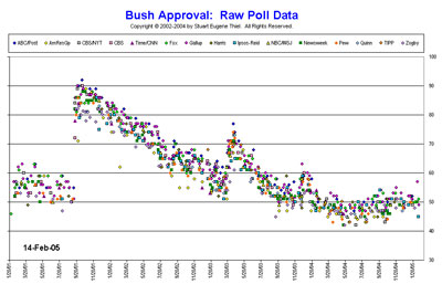
During 2004, the average Bush job rating did not vary much. It dropped a few points in April and May during the 9/11 Commission hearings and the disclosure of prisoner abuse at the Abu Ghraib prison. It rose a few points following the Republican convention and has held remarkably steady ever since.
The graph also shows that “big swings” do appear by chance alone for the occasional individual survey. These are “outliers.” On the chart, a few polls fall outside the main band of points, and the February 4-6 Gallup survey is an obvious example. It shows up as the diamond-shaped pink point at the far right of the Pollkatz graphic (click on the image or here to see the fullsize version at pollkatz.com).
How often does such an outlier occur? Remember that the “margin of error” reported by most polls assumes a “95% confidence interval.” That means that if we drew repeated samples, we can assume that 19 of 20 would produce results for any given question that fall within a certain margin of error. However, we should expect at least 1 in 20 to fall outside of sampling error by chance alone.
With the benefit of hindsight, it seems obvious that the February 4-6 Gallup was just such an outlier. Other surveys done just before and after (see the always user friendly compilation on RealClearPolitics.com) show no comparable surge and decline in Bush’s job rating in early February.
The bigger question then is what CNN, USAToday and Gallup should have done – without the benefit of hindsight – when they released the February 4-6 survey. Steve Soto immediately requested the party identification numbers from Gallup and found that the survey also showed an unusual Republican advantage. His commentary and that of Ruy Teixeira again raise the issue of whether surveys like Gallup should weight by party ID.
I wrote about this issue extensively in September and October. Here’s a quick review:
Most public survey organizations, including Gallup, do not weight by party identification (Gallup has restated their philosophy on this issue in their blog, see the February 10 entry). Unlike pure demographic items like age and gender, Party ID is an attitude which can change especially from year to year (although academics continue to debate just how much and under what conditions, see the recent reports by the National Annenberg Election Survey and the Pew Research Center for discussion of long term trends in party identification).
The problem is that partisan composition of any sample can also vary randomly — outliers do happen. Unfortunately, when they do we get news stories about “trends” that are really nothing more than statistical noise. To counter this problem, some pollsters, such as John Zogby, routinely weight their surveys by some arbitrary level of party identification. The problem with this approach is deciding on the target and when, if ever, to change it. Zogby often uses results from exit polls to determine his weight targets. Raise your hand if you consider that approach sound given what we have learned recently about exit polls.
The conflict leads to some third-way approaches that some have dubbed “dynamic weighting.” I discussed these back in October. The simplest and least arbitrary method is for survey organizations to weight their polls by the average result for party identification on recent surveys conducted by that organization — perhaps over the previous three to six months. The evolving party identification target from the larger combined sample would smooth out random variation while allowing for gradual long-term change (see also Prof. Alan Reifman’s web page for more commentary on this issue).
I am not an absolutist about this, but I am less comfortable with dynamic weighting in the context of periodic national news media surveys than for pre-election tracking surveys. There are times when dynamic party weighting would make a poll less accurate. Consider the Pew party ID data which showed a sharp increase in Republican identification after 9/11. Dynamic weighting surveys done at the time would have artificially and unfairly decreased Republican identifiers.
With hindsight, it is easy to see those patterns in the data, just as it is easy to see that the February 4-6 Gallup numbers were likely a statistical aberration. But without the benefit of hindsight, how does a news media pollster really know for certain? Media pollsters are right to strive for objective standards rather than ad hoc decisions on weighting by party.
When Steve Soto looked at the unusual Republican tilt in Gallup’s party ID numbers on their February 4-6 survey, he concluded that “Gallup appears to be firmly a propaganda arm of the White House and RNC.” I don’t think that’s fair. Gallup did not “look at the electorate” and “somehow feel” that party ID should be a certain level, as Soto describes it. Actually, Gallup did just the opposite. They measured public opinion using their standard methodology and refused to arbitrarily tamper with the result. We may not agree with that philosophy, but Gallup believes in letting the chips (or the interviews) fall where they may.
I do agree with Soto on one important point: The party ID numbers ought to be a standard part of the public release of any survey, along with cross-tabulations of key results by party identification. Gallup should be commended for releasing data on request even to critics like Soto, but it really should not require a special request.
Also, when a survey shows a sharp shift in party identification, news coverage of that survey should at least note the change — something sorely lacking in the stories on CNN and in USAToday about the February 4-6 survey. Consider this example from the Wall Street Journal‘s John Harwood on the recent NBC News/WSJ poll:
Public approval of Mr. Bush’s job performance held steady at 50%, while 45% disapprove. Because the new WSJ/NBC poll surveyed slightly more Democrats than the January poll, that overall figure actually masks a slight strengthening in Mr. Bush’s position. While the views of Democrats and Republicans remained essentially unchanged, independents were more positive toward Mr. Bush than a month ago.
Of course, this sort of analysis raises its own questions: What was the sample size of independents? Was the change Harwood observed among independents statistically significant? The story does not provide enough detail to say for sure. But at least it acknowledges the possibility that change (or lack of change) in the overall job rating may result from random differences in the composition of the sample. That is an improvement worth noting.
Outliers happen. Truly objective coverage of polls needs to do a better job acknowledging that possibility.
minor typos corrected
Excellent analysis and commentary Mark.
This PROVES that Kerry won!
Party ID is an eerie presence in the House of Opinion. More stable that it has any right to be in the long run, and more volatile than it has any right to be in the short run.
At any given time, there are a lot of people who mostly think like Republicans, and mostly vote like Republicans, but are loathe to call themselves “Republican”.
Some think the GOP has gone too far left. Some think the GOP has gone too far right. Some broke with the party over a single hot-button issue, or a local project, or a misbehaving officeholder. Some have been active in party ranks, and gotten alienated by something in the process. Some are deliberate holding out for a better offer in the form of some hoped-for “reform”. And many are simply proud of calling themselves “Independent”, in denial of their latent Republican souls.
And then there are populations of marginally-Republican thinkers/voters, and true independents, and true misfits within the current configuration of US political parties.
So what? I’ll tell you what.
When polled on a particular day, with particular questions, in a particular news context, many of these “woodwork Republicans” will shift into or out of GOP self-identification … depending what message they’re trying to transmit through the polling apparatus.
Respondents will surmise as to the issue of the day, and whose ox is to be gored, and will shade their responses accordingly.
If there’s a war on, and the war is a Defining Issue, and Republican policy is pro-war, and they personally approve of the war, they’ll come out of the woodwork and present themselves as Republicans. If they oppose the war, they’ll shade themselves to the Independent side.
If one of their GOP heroes is under attack, or if Dem’s have done something special to get under their skin, they’ll come out of the woodwork to punish the Democrats.
If GOP standard-bearers are up to something conspicuously stupid, they’ll punish their party by holding out.
And similar at the Democratic end of the “independent” spectrum.
“Party ID” is almost always trying to tell you something important about something … but it will rarely tell you much about Party ID.
“If there’s a war on, and the war is a Defining Issue, and Republican policy is pro-war”
Pro-war? That’s nutz. Who is pro war? The issue is war now when it’s manageable, or war later when it’s unmanageable. No one is truly pro-war.
I recommend a great book written by John F. Kennedy, “Why England Slept.” JFK wrote the book as a senior in college and had it reprinted shortly after becoming president. Great book, and while it doesn’t perfectly explain the ideology behind Bush’s policies, nor the policies of hawkish Republicans perfectly, it goes a long way to describe the “doves” that allowed WWII to be as terrible as it was.
So I’ll accept the label of being “pro-war” so long as it describes a Churchillian “pro-war” stance. Will you accept a Chamberlain “anti-war” label?
For heaven’s sake, Rick, was that called for?
It’s a shorthand hypothetical illustrative example in an already-lengthy post regarding context effects on Party ID. It has nothing to do with real Republicans, or their real attitudes about real war(s), or my real attitudes about their real attitudes … and if it did, I wouldn’t post it here.
If you find the example confusing, please substitute “a particular war” for “a war”, “the war in question” for “the war”, and “in favor of the war in question” for “pro-war”. Or substitute your choice of another momentary Defining Issue.
Sorry, Mark.
“On Outliers and Party ID” brings a welcome note of context and perspective to–not polling itself, but the reporting and packaging of polls. The media, who publish, and often commission, these polls, should put in notes of statistical caution when they report, in big headlines, sudden “surges” in poll numbers. As we know, the media won’t do this, preferring the splashy headline to the sober reality. And sadly, I suspect a lot of polling companies won’t throw in these notes of caution either, since attention-getting poll numbers bring them free publicity.
I agree one problem with dynamic weighting is that it locks in a Party ID that was probably true in the recent past, but doesn’t take into account the present.
There is a slightly different approach I call the “Floating Anchor Weight” (or FAW).
Take party identification scores (GOP and DEM) from the three most recent N=1,000 or greater unweighted surveys (only surveys without any sort of message testing, which may have caused more mid-interview terminates from Republican or Democratic respondents).
Calculate the FAW for GOP and DEM independently according to the following equation:
(most recent survey party ID x 3) + (next most recent ID x 2) + (3rd most recent ID x1) / 6
When your new results come, if party ID for the GOP or DEM is within 1% of the FAW, apply no weight to that score. If the GOP or DEM party ID number is outside 1% from the FAW, bring it down to exactly 1% off the FAW. Any raised or lowered GOP or DEM party ID weight will only effect the remaining “Independent” score, which will be the remainder of what is left once the GOP and DEM final weight (or lack of) is determined.
Thus you have a weight that would allow some consistency of the data, but allow any recent fluctuations to be felt.
For example, say we had three reliable nationwide surveys with the following unweighted party identification:
date GOP DEM
2/9 45.3 45.6
2/14 46.7 44.9
2/21 45.9 44.7
The GOP FAW would be 46.1% and the DEM FAW would be 44.9%
So your new survey results come back (2/23), and have the following unweighted party identification: GOP 47.8%, DEM 45.3%, IND 6.9%
The FAW would kick in on the GOP score, and it would be lowered back to 47.1%, which is 1-point away from the FAW. For the DEM, however, since the unweighted is within 1-point of the FAW, it would remain at 45.3%. Independents would be assigned 7.6% to make everything add up to 100%.
Next time, however, we would calculate the FAW scores by dropping the 9/9 survey, and adding the unweighted 9/23 results to the equation.
So the FAW will move itself with time, and be reactive to changes in intensity that are actually moving party ID, but it will act as a check against a party ID that is anomalous. And while any anomaly that does crop up will be a component of the FAW for a while, it will quickly work its way out and always be kept in check by other surveys.
By the way, “floating anchor” is a nautical term for an anchor that does not rest in one place on the floor of the body of water, but either can move along the floor or simply dangles in the open sea. This type does not keep the boat rigidly in one place, but rather allows it slowly drift by creating enough drag to limit the movement.