A few weeks ago, I asked if readers were “tired of exit polls yet.” The replies, though less than voluminous, were utterly one sided. Twenty-five of you emailed to say yes, please continue to discuss the exit poll controversy as warranted. Only one emailer dissented, and then only in hope that I not let the issue “overwhelm the site.” Of course those responses are a small portion of those who regularly visit MP on a daily or weekly basis, who for whatever reason, saw no pressing need to email a reply. To those who responded, thank you for your input. I will continue to pass along items of interest when warranted.
One such item came up late last week. A group called US Count Votes (USCV) released a new report and executive summary — a follow-up to an earlier effort — that collectively take issue with the lengthy evaluation of the exit polls prepared for the consortium of news organizations known as the National Election Pool (NEP) by Edison Research and Mitofsky International. The USCV report concludes that “the [exit poll] data appear to be more consistent with the hypothesis of bias in the official count, rather than bias in the exit poll sampling.” MP has always been skeptical of that line of argument, but while there is much in USCV report to chew over, I am mostly troubled by what the report does not say.
First some background: The national exit polls showed a consistent discrepancy in the vote that favored John Kerry. The so-called “national” exit poll, for example, had Kerry ahead nationally by 3% but George Bush ultimately won the national vote by a 2.5% margin. Although they warned “it is difficult to pinpoint precisely the reasons,” Edison-Mitofsky advanced the theory that “Kerry voters [were] less likely than Bush voters to refuse to take the survey” as the underlying reason for much of the discrepancy. They also suggested that “interactions between respondents and interviewers” may have exacerbated the problem (p.4). The USCV report takes dead aim at this theory, arguing that “no data in the report supports the E/M hypothesis” (USCV Executive Summary, p. 2).
The USCV report puts much effort into an analysis of data from two tables provided by Edison-Mitofsky on pp. 36-37 of their report. As this discussion gets into murky statistical details quickly, let me first try to explain those tables and what the USCV report says about them. Both tables show averages values from 1,250 precincts in which NEP conducted at least 20 interviews and was able to obtain precinct level election returns. Each table divides the exit poll categories into five categories based on the “partisanship” of the precinct. In this case, partisanship really means preference for either Bush or Kerry. “High Dem” precincts are those where John Kerry received 80% or more of the vote, “Mod Dem” precincts are where Kerry received 60-80% and so on.
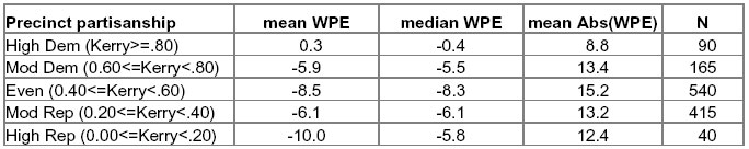
The first table shows a measure of the average precinct level discrepancy between the exit poll and the vote count that Edison-Mitofsky label “within precinct error” (or WPE – Note: I reproduced screen shots of the original tables below, but given the width of this column of text, you will probably need to click on each to see a readable full-size version).

To calculate the error for any given precinct, they subtract the margin by which Bush led (or trailed) Kerry in the count from the the margin by which bush led (or trailed) Kerry in the unadjusted poll sample. So (using the national results as an example) if had Kerry led on the exit poll by 3% (51% to 48%), but Bush won the precinct count by 2.5% (50.7% to 48.3%), the WPE for that precinct would be -5.5 [ (48-51) – (50.7 – 48.3) = -3 – 2.5 = -5.5. A negative value for WPE means Kerry did better in the poll than in the count, positive values mean a bias toward Bush. Edison-Mitosfky did this calculation for 1,250 precincts with at least 20 interviews per precinct and where non-absentee Election Day vote counts were available. The table shows the average (“mean”) for WPE, as well as the median and the average “absolute value” of WPE. In the far right column the “N” size indicates the number of precincts in each category.
The average WPE was -6.5 percent – meaning an error in the Bush-Kerry margin of 6.5 points favoring Kerry. The USCV places great importance on the fact that average WPE (the “mean”) appears to be much bigger in the “High Rep” precincts (-10.0) and than in the “High Dem” precincts (+0.3).
The second table shows the average completion rates across same partisanship categories.
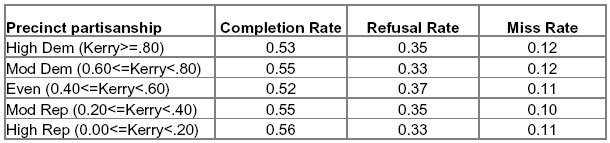
MP discussed this particular table at length back in January. A bit of review on how to read the table: Each number is a percentage and you read across. Each row shows completion, refusal and miss rates for various categories of precincts, categorized by their level of partisanship. The first row shows that in precincts that gave 80% or more of their vote to John Kerry, 53% of voters approached by interviewers agreed to be interviewed, 35% refused and another 12% should have been approached but were missed by the interviewers.
The USCF report argues that this table contradicts the “central thesis” of the E-M report, that Bush voters were less likely to participate in the survey than Kerry voters:
The reluctant Bush responder hypothesis would lead one to expect a higher non-response rate where there are many more Bush voters, yet Edison/Mitofsky’s data shows that, in fact, the response rate is slightly higher in precincts where Bush drew ?80% of the vote (High Rep) than in those where Kerry drew ?80% of the vote (High Dem). (p. 9)
As I noted back in January, this pattern is a puzzle but does not automatically “refute” the E-M theory:
If completion rates were uniformly higher for Kerry voters than Bush across all precincts, the completion rates should be higher in precincts voting heavily for Kerry than in those voting heavily for Bush….However, the difference in completion rates need not be uniform across all types of precincts. Mathematically, an overall difference in completion rates will be consistent with the pattern in the table above if you assume that Bush voter completion rates tended to be higher where the percentage of Kerry voters in the precincts was lower, or that Kerry voter completion rates tended to be higher where the percentage of Bush voters in the precincts was lower, or both. I am not arguing that this is likely, only that it is possible.
The USCV report essentially concedes this point but then goes through a series of complex calculations in an effort to find hypothetical values that will reconcile the completion rates, the WPE rates and the notion that Kerry voters participated at a higher rate than Bush voters. They conclude:
[While] it is mathematically possible to construct a set of response patterns for Bush and Kerry voters while faithfully reproducing all of Edison/Mitofsky’s “Partisanship Precinct Data”… The required pattern of exit poll participation by Kerry and Bush voters to satisfy the E/M exit poll data defies empirical experience and common sense under any assumed scenario. [emphasis in original]
I will not quarrel with the mechanics of their mathematical proofs. While there are conclusions I differ with, what troubles me most is what USCV does not say:
1) As reviewed here back in January, the Edison-Mitofsky report includes overwhelming evidence that the error rates were worse when interviewers were younger, relatively less experienced, less well educated or faced bigger challenges in selecting voters at random. The USCV report makes no mention of the effects of interviewer expeerience or characteristics and blithely dismisses the other factors as “irrelevant” because any one considered alone fails to explain all of WPE. Collectively, these various interviewer characteristics are an indicator of an underlying factor that we cannot measure: How truly “random” was the selection of voters at each precinct? It is a bit odd – to say the least – that the USCV did not consider the possibility that the cumulative impact of these factors might explain more error than any one individually.
[Clarification 4/10 : As Rick Brady points out, errors in either direction (abs[WPE]) were highest among the least well educated. However, WPE in Kerry’s favor was greatest among interviewers with a post-graduate education].
2) More specifically, the USCV report fails to mention that poor performance by interviewers also calls into question the accuracy of the hand tallied response rates that they dissect at great length. Edison-Mitofsky instructed its interviewers keep a running hand count of those who they missed or who refused to participate. If WPE was greatest in precincts with poor interviewers, it does not take a great leap to consider that non-response tallies might be similarly inaccurate in those same precincts.
MP can also suggest a few theories for why those errors might artificially depress the refusal or miss rates in those problem precincts. If an interviewer is supposed to interview every 5th voter, but occasionally takes the 4th or the 6th because they seem more willing or approachable, their improper substitution will not show up at all in their refusal tally. Some interviewers having a hard time completing interviews may have fudged their response tallies out of fear being disciplined for poor performance.
3) Most important, the USCV report fails to point out a critical artifact in the data that explains why WPE is so much higher than average in the “High Rep” precincts (-10.0) and virtually non-existent in the “High Dem” precincts (+0.3). It requires a bit of explanation, which may get even more murky, but if you can follow this you will understand the fundamental flaw in the USCV analysis.
[4/13 – CLARIFICATION: On April 11 and 12, 2005, after this message
was posted, the USCV authors twice revised their paper to include and then
expand a new Appendix B that discusses the implications of this artifact. 4/14 – As I am in error below in describing the artifact, my conclusion that it represents a “fundamental flaw,” is premature at best ]
Given the small number of interviews, individual precinct samples will always show a lot of “error” due to ordinary random sampling variation. I did my own tabulations on the raw data released by NEP. After excluding those precincts with less than 20 interviews, the average number of unweighted interviews per precinct is 49.3 with a standard deviation of 15.9. That’s quite a range — 10% of these precincts have an n-size of just 20 to 30 interviews — and makes for a lot of random error. For a simple random sample of 50 interviews the ordinary “margin of error” (assuming a 95% confidence level) is +/- 14%. With 30 interviews that error rate is +/- 18%. The error on the difference between two percentages (the basis of WPE) gets bigger still.
Edison-Mitofsky did not provide the standard errors for their tabulations of WPE, but they did tell us (on p. 34 of their report) that the overall standard deviation for WPE in 2004 was 18.2. If we apply the basic principals of the standard deviation to an average WPE of -6.5, we know that 68% of precincts had WPEs that ranged from from -24.7 in Kerry’s favor to 11.7 in Bush’s favor. The remaining third of the precincts (32%) had even greater errors, and a smaller percentage — roughly 5% — had errors greater than -42.9 in Kerry’s favor or 36.4 in Bush’s favor. That’s a very wide spread.
First consider what would happen if the vote count and exit poll had been perfectly executed, with zero bias in any direction. Even though the random error would create a very wide spread of values for WPE (with a large standard deviation), the extreme values would cancel each other out leaving an average overall WPE of 0.0.
Now consider the tabulation of WPE by precinct partisanship under this perfect scenario. In the three middle partisanship categories where each candidate’s vote falls between 20% or 80% (Weak Rep, Even and Weak Dem) the same canceling would occur, and WPE would be close to zero.
But in the extreme categories, there would be a problem. The range of potential error is wider than the range of potential results. Obviously, candidates cannot receive more than 100% or less than 0% of the vote. So in the “Strong Rep” and “Strong Dem” categories, where there candidate totals are more than 80% or less than 20%, the ordinarily wide spread of values would be impossible. Extreme values would get “clipped” in one direction but remain in place in the other. Thus, even with perfect sampling, perfect survey execution and a perfect count, we would expect to see a negative average WPE (an error in Kerry’s favor) in the “Strong Rep” precincts and a positive average WPE (an error in Bush favor) in the in the “Strong Dem” category. In each “Strong” category, the extreme values on the tail of the distribution closest to 50% would pull the average up or down, so the median WPE would be closer to zero than then mean WPE. Further, the absolute value of WPE would be a bit larger in the middle categories than the “Strong” categories. The table would show differences in WPE between Strong Dem and Strong Rep precincts, but none would be real.
[4/14 – My argument that random error alone causes such an artifact is not correct].
Now take it one step further. Assume a consistent bias in Kerry’s favor — an average WPE of -6.5 — across all precincts regardless of partisanship. Every one of the averages will get more negative, so the negative average WPE in the Strong Rep precincts will get bigger (more negative) and the positive average WPE will get smaller (closer to zero). Look back at the table from the Edison-Mitofsky report. That’s exactly what happens. Although the average WPE is -6.5, it is -10.00 -10.04 in the Strong Rep precincts and 0.3 0.5 in the Strong Dem.
Finally, consider the impact on the median WPE (the median is the middle point of the distribution). For the Strong Rep category, pulling the distribution of values farther away from 50% increases the odds that extreme values on the negative tail of the distribution will not be canceled out by extreme values of the positive end. So for Strong Rep, the median will be smaller than the mean. The opposite will occur on the other end of the scale. For the Strong Dem category, the distribution of the values will be pulled closer to 50%, so the odds are greater that the extreme errors on the negative end of the distribution (in Kerry’s favor) will be present to cancel out some of the extreme errors favoring Bush. Here the mean and median WPE will be closer. Again, this is exactly the pattern in the Edison-Mitfosky table.
Thus, the differences in WPE by precinct partisanship appear to be mostly an artifact of the way the data were tabulated. They are not real.
[4/14 – Given the error above, this conclusion is obviously premature. A similar artifact based on randomly distributed clerical errors in the count data gathered by Edison-Mitofsky may produce such a pattern. I’ll have more to say on this in a future post]. .
Yet the USCV report plows ahead using those differences in a long series of mathematical proofs in an attempt to refute the Edison-Mitofsky theory. As far as I can tell, they make no reference to the possibility of an artifact that the Edison-Mitofsky report plainly suggests in the discussion of the table (p. 36):
The analysis is more meaningful if the precincts where Kerry and Bush received more than 80% of the vote are ignored. In the highest Kerry precincts there is little room for overstatement of his vote. Similarly the highest Bush precincts have more freedom to only overstate Kerry rather than Bush. The three middle groups of precincts show a relatively consistent overstatement of Kerry.
[4/13 CLARIFICATION & CORRECTION: As noted above, the new Appendix B of the USCV report now discusses this implications of this artifact and implies that the authors took this artifact into account in designing the derivations and formulas detailed in Appendix A. A statistician I consulted explains that their formulas make assumptions about the data that minimize or control for artifact. I apologize for that oversight]
Read the USCV report closely and you will discover that their most damning words- “dramatically higher,” “very large spread,” “implausible patterns,” “defies empirical experience and common sense” – all apply to comparisons of data derived from the phantom patterns in the Strong Dem or Strong Rep precincts. Next follow the advice from Edison-Mitofsky and examine their charts and tables (like the one copied below), but ignoring the end points. The patterns seem entirely plausible and tend to support the Edison-Mitofsky theory rather than contradict it.
But USCV goes further, arguing that the difference between the mean and median values of WPE in Strong Bush precincts supports their theory that “vote-counting anomalies occurred disproportionately in ‘high-Bush’ precincts” (p. 15). To put it nicely, given what we know about why the mean and median values are so different in those precincts, that argument falls flat.
The statistical artifact that undermines the USCV argument was not exactly a secret. The Edison-Mitofsky report alluded to it. It was also discussed back in January on the AAPOR member listserv, a forum widely read by the nation’s foremost genuine experts in survey methodology. You can reach your own conclusions as to why the USCV report made no mention of it.
UPDATE: A DailyKos diarist named “Febble” has done a very similar an intriguing post that points up a slightly different artifact in the NEP data. It’s definitely worth reading if you care about this subject.
[4/13 & 4/14 – CLARIFICATION & CORRECTION: As noted above, the USCV report now discusses a similar the artifact and its implications. I overlooked that the assumptions of the derviations made by the USCV authors may be that are relevant to the artifact I should have described. In retrospect, I was in error to imply that they failed to take the artifact into account and my conclusions about the implications of their derived values was premature. As such, I struck the two sentences above. I apologize for the error which was entirely mine.
In clarifying these issues in Appendix B, the USCV authors indicate that the derived response rates they consider most implausible occur in the 40 precincts that were most support of George Bush (pp. 26-27):
WPE should be greatest for more balanced precincts and fall as precincts become more partisan. The data presented on p. 36, 37 of the E/M report and displayed in Table 1 of our report above, show that this is the case for all except the most highly partisan Republican precincts for which WPE dramatically increases to -10.0%. Our calculations above show the differential partisan response necessary to generate this level of WPE in these precincts ranges from 40% (Table 2) to an absolute minimum of 20.5% (Table 4)…
The dramatic and unexpected increase in (signed) mean WPE in highly Republican precincts of -10.0%, noted above, is also unexpectedly close to mean absolute value WPE (12.4%) in these precincts. This suggests that the jump in (signed) WPE in highly partisan Republican precincts occurred primarily because (signed) WPE discrepancies in these precincts were, unlike in [the highly Democratic precincts] and much more so than in [the middle precincts], overwhelmingly one-sided negative overstatements of Kerry’s vote share.
To assess the plausibility of the dervied response rates in the Republican precincts, we need to take a closer look at the assumptions the authors make and their implications. I will do so in a subsequent post.]
There is more of relevance that the USCV leaves out, but I have already gone too long for one blog post. I will take up the rest in a subsequent post. To be continued…
Nice post. Can’t wait for part two. And febble’s work appears excellent as well. She contributed to the US Count Votes study, but declined to sign her name. I wonder what she will think about this post?
I haven’t worked through her spreadsheets and SPSS data that she sent, but I finally understand the logic behind her formula for converting WPE to her index bias – not easy for a City Planner 😉
One thing from the E-M report that I think bolsters your argument is the mean Abs(WPE) column in the first table you post above.
As you demonstrate (and E-M state), the exit poll in Kerry strongholds (80-100%) has little freedom (lower probability) to overestimate his vote, whereas the exit poll in Bush strongholds has more freedom (greater probability) to underestimate Bush’s vote.
Whereas the mean sign WPE is useful for precincts where proprotions derived from samples would approximate a normal distribution (i.e., in the more moderate precincts), the sign of WPE becomes less important when comparing two extremes.
The mean Abs(WPE) is more useful to understand differences in means of WPE at the extremes, but not perfect because there is still some freedom in most of these precincts to overestimate Kerry’s vote or underestimate Bush’s vote. That is, the mean Abs(WPE) of 8.8 in Kerry strongholds and mean Abs(WPE) of 12.4 in Bush strongholds amplifies your point, but the apparently higher mean Abs(WPE) in Bush strongholds might not be “real” either.
What are the implications for the US Count Votes Appendix A?
I suggest that the “implausible” disparity in completion rates by party in the extremely partisan precincts is real, but most of it can be explained independent of reluctant Bush voters or biased non-random sample selection from poorly trained interviewers. That makes their finding interesting, but after further anlysis, one of no real consequence.
A month or so ago I stated that, without the actual precinct data, it would be impossible to make the case for anything (bashful Bushies, voter fraud, whatever). However, as long as others use the data to make a case for their theories, their logic must be questioned. You, Rick, and, now, “febble” are doing good work. Thanks.
Early exit polls showed enormous Kerry leads in closely-contested states: 60-40 in Pennsylvania, 59-41 in New Hampshire. On Election Night, the networks were unable to make quick calls in states Bush won overwhelmingly because the available exit data indicated surprisingly close races (just as in 2000, when states Gore won by margins of 2-4 points were somehow able to be called instantly, while states Bush won by 11-13 points remained “too close” for up to an hour). Michael Barone, political analyst for the U.S. News & World Report, believes that Democrats “slammed” the exit polls, stating that the hypothesis fits all the known facts. If you reject this theory, then you need to account for those surreal results (why exactly was Alabama (!) “too close to call”?). If you accept it, then the padding of Kerry’s early percentage accounts for his final margin.
Two problems with my “bias index” as I see it:
One is that I calculated it from the mean WPEs as given in the EM report. However, my formula should really be applied to each precinct before averaging, rather than to the WPEs after averaging, as we do not know the partisanship of the precincts from which each WPE was calculated, only the partisanship of the state. My procedure is only valid to the extent to which these are correlated. However, because the mean WPEs were available, they seemed better than nothing, and better still after my procedure to “decontaminate” them from the effect of partisanship. Because what I was interested in was the correlation between state partisanship and bias.
The other problem with my bias index is that it would seem to break down with very small samples in extremely partisan precincts. If there is only one Kerry voter in a precinct, you will either poll him/her or you won’t. The standard error of the WPE will be small, but the standard deviation of the bias index will be large (and the mean across several similar precincts will be zero). However, this problem doesn’t apply at state level (although the first problem does).
But to return to the purpose of my exercise, which was to look for a relationship between bias and state partisanship that might indicate fraud:
It seemed to me that if fraud had been selectively targetted, the most logical place would be in the swing states, which should give a quadratic relationship between state partisanship and bias. If fraud was applied randomly across the nation (to “pad” the mandate) then it should have no relationship. However, I found not a sniff of a significant quadratic term, and a strong positive (in my bias index, by a quirk, positive=over-estimate of Kerry vote) correlation with the percentage of the Democratic vote. The bluer the state, the greater the Democratic bias. To me, this looks far more like sampling bias than fraud, as a pattern.
In other years, the correlation, if significant, was similarly relentlessly linear. However, the sign of the correlation between bias and state partisanship was interesting, in that while it was insignificantly negative in 2000, where the net bias was also low, it was significantly negative in both 1992 and 1996, where Perot was on the ballot. It was weakly positive in 1988, where the bias was stronger than in 2000, and the election was another two horse race.
This pattern (to the extent that my index is a valid indicator of bias) suggests to me that the most parsimonious explanation of the patterns in different years is that bias is greater where interest in the election is high (as EM point out), and that its correlation with state partisanship may reflect embarassment of of Republican voters when they have an unpopular candidate. In 1988, Bush voters in Democratic states may simply have managed to avoid the polls (can’t imagine many would have wanted to fake a belief in Dukakis). In 1992 and 1996, Bush voters may have said they voted for Perot, especially in Republican states (they presumably wouldn’t be seen dead saying they’d voted for Clinton). In 2000 they didn’t care. In 2004, in Democratic states, they either said they’d voted for Kerry (or again, avoided saying anything at all). In other words, the bias reflects a natural tendency not to want to be seen backing a loser, that seems for some reason to be stronger in Republicans (presumably Democrats, like Labour Party supporters here in the UK, have had plenty of practice….)
This is pure hunch, but it looks more plausible than fraud.
Regarding the USCV analysis: I have two (and a bit) problems. One is that, as you point out, that they appear to assume that precincts only had one problem apiece, which seems unlikely, although because the EM report doesn’t report a multiple regression analysis, we don’t know how much variance in WPE each factor accounted for. Also, if EM did do a multiple regression, I think they should have done it on my bias indices (or similar) rather than on the WPEs.
The second problem I see is that USCV make quite a big deal of the oddity in the highly Republican precincts, including the difference between median and mean. Apart from the confound between partisanship and WPE discussed above, there is also the matter of the N. There were only 40 precincts in this category, and only a few of them (from the inferred skew) seem to be leveraging the average. Maybe fraud is the answer to the oddity in these precincts. But that means we are talking about a handful of precincts. It seems unlikely that, even extrapolated through the nation that this would account for the magnitude of the exit poll discrepancy.
And yet it is this magnitude that appears to be the rationale for suspecting fraud in the first place (this last is “the bit” of my reservations).
(1) Nationally, the extreme quintiles are better treated as 80-85% Kerry than 80-100% Kerry, and 15-20% rather than 0-20%. Utterly brand-loyal districts are statistical rarities, the tails of a precinct partisanship distribution overlapping the near side of an arbitrary interval. Maybe ranked-ordered quintiles, deciles, etc., would shed more light thatn than E/M’s 5 equal-subrange intervals.
(2) We’ve largely exhausted whatever might be learned from the means and medians of large aggregates. Legitimate privacy concerns prevent release of data down to precinct and individual response level. And we’re still mired in suspicion and speculation.
(3) That doesn’t necessarily leave us at a dead end. E/M (or some acceptably disinterested and trusted proxy) might agree to accept nominations of specific tests, run them against the detailed survey data, and publish results. This would be somewhat cumbersome, somewhat costly, and necessarily iterative … but it might get us to a point of mutual agreement re what is or isn’t in the data.
The problem might be of sufficient technical and public interest to merit foundation funding.
RonK,
#1: Certainly. Even if we had a table with 10 ordinal categories of partisanship with the Ns and mean, median, and mean AbsWPEs, we could have a better idea of what is going on in the extremely partisan precincts.
#2: True – not much more can be learned from the released data, but I don’t think many rational analysts are mired in suspicion or speculation. As febble said, results of the multiple regression model that E-M _must_ have run, would be nice.
My guess is that E-M ran the model, were confident that they had explained enough of WPE by a host of interviewer and precinct characteristics and concluded that these regressed factors are responsible for the differential response. Then they wrote a media exec friendly report with simple crosstabs and means to explain their findings. It was not written for statisticians or data dweebs like us. Febble’s bias index seems to be a better dependent than the WPE, but as they say, close enough for government work, right?
#3: You know, I have asked E-M if they would be open to that… No response… yet…
Re “close enough for government work”:
Close enough if we don’t want to plot bias by partisanship, but not if we do.
For example, if (like USCV), we want to conclude (or not) anything about bias in highly partisan precincts, relative to bias in less partisan precincts.
And also if (like me) we want to investigate the nature of the relationship between partisanship of states and/or localities and bias.
Febble, I was being a bit sarcastic 😉
Rick:
Yes, I did realise! I just meant that conclusions based on the WPE may be good-enough-for-jazz when partisanship isn’t on the other side of the equation, but not when it is. In other words I’m not trashing all conclusions on the basis of my bit of fancy algebra, just some.
As she points out above, Febble’s fancy function would mean more when applied to data points that to group means.
IIRC, Kaminsky went down this road earlier (and bogged down?), and I editorialized on the limits of linear manipulation of hyperbolic-on-both-ends data.
I don’t think all reasonable minds are satisfied, and I wouldn’t wish to send them home early, and we still have a number of well-intended unreasonable minds, er, adversarial advocates to settle with.
And I am still curious what Campbell Read’s name is doing on the USCV papaer.
RonK,
I think we agree that a very thorough multivariate regression of the interval data would be best.
If E-M would release the results, and if, as I assume, it shows that certain interviewer and precinct characteristics, consistent with the January Report, explain a large portion of WPE, a lot of the remaining reasonable minds might “go home.”
I assume E-M did something like this, but doubt they included all the independent variables that the “well-intended adversarial advocates” could think of. Also, they likely used WPE rather than febble’s index or something similar, but who knows for sure? That said, the model could probably be improved and could answer many remaining questions.
Can you point me to your editorial “on the limits of linear manipulation of hyperbolic-on-both-ends data”?
Also, why are you curious that Dr. Read is a signatory?
Read is the only named name (not exactly co-authors, but presumably contributors of some sort) with sterling credentials in the field of statistics. Most are marginal academics and/or practitioners in tangential or unrelated disciplines.
By “editorial” I refer to comments in the comments of MP (or possibly elsewhere). No real gems in there … just the equivalent of Febble’s observation that WPE is not a linear function of response bias, and MP’s observations on distribution effects at the extremes.
Hypothesis testing would have to be an iterative series of challenges, until something interesting came up or the challengers got bored and went home.
Of course somebody will have to come up with a six-figure grant to run the tests, and somebody will have to organize a jury to evaluate test proposals and decide what gets run.
RonK, you’re telling me that my e-mail to E-M asking if they would test a model of my suggested variables will not be taken seriously?
I had my hopes and future pinned on that e-mail… Drats… 😉
RonK, do you have a PhD? I’ve been told that US Count Votes won’t respond to any criticism of their work unless the challenger has a PhD. Neither Febble nor MP have a PhD. If you did, maybe you could co-sign their criticism and force a response!
The PhD requirement for criticism seems a bit more like the Latin requirement of the Catholic Church in the middle ages than a rule of modern science:
If you do not speak Latin, which of course you can’t unless you have the proper education and have ordination to prove it, then you cannot read or interpret the Holy Text, let alone criticize it!
Yeah, I know I’m being a bit snarky. I’m tired…
I’m noticing something strange, but perhaps not too strange.
The N for “Over 500,000” was 105, and the N for “High Dem” was 90.
I assumed that the “clipping” effect would show up to some degree in the “Over 500,000” precincts. That is, if a large portion of the “High Dem” precincts were also “Over 500,000” precincts, I would expect to find a WPE closer to zero. But, we find that the mean WPE in “Over 500,000” was -7.9 and 0.3 in “High Dem” precincts.
Any thoughts anyone?
Re Campbell Read – it was Campbell Read who warned me of the problems of using t tests with proportional data such as the WPE (I had realised the problem at that stage, but had not attempted to solve it). He referred me to was a book: UNIVARIATE DISCRETE DISTRIBUTIONS (Second Edition) by Norman Johnson, Samuel Kotz and Adrienne Kemp (1992), published by Wiley; Chapter 3, Section 6.1 and section 6.2. I did not (and do not) have easy action to this reference, so I devised my own hand-cranked solution.
However, the problem Read noted with my original t tests on the WPEs would seem also to be applicable to the conclusions drawn in the USCV report, as well as to the averaging of the state WPEs in the EM report. Sounds like everyone should be taking more notice of Campbell Read!
Mark,
My concerns here are three:
1) You have alluded in several places–both in this post, and in others–to the fact that a complete analysis of the E/M data, one which fully responds to all possible areas of inquiry, is impossible at this time because not all of the necessary data has been released by E/M. Three sub-questions here:
a) What is being done, by you and by others who doubt the U.S. Count Votes analysis (and, moreover, are writing impliedly against its conclusions, albeit in good faith) to ensure that E/M releases this vital data, and quickly?
b) Is it not statistically, procedurally, and (dare I say) scientifically sound to maintain skepticism over a scientific conclusion until that conclusion has been verified? Is a scientist, or exit-pollster, not called upon, in this scenario, to favor the U.S. Count Votes analysis until it is proven incorrect? While I would not normally make this argument–in fact, might argue that the proof lies with the opposing party–considering points 1a (above) and 1c (below), aren’t the normal rules of intellectual engagement of a dilemma necessarily amended?
c) E/M are purportedly professional exit-pollsters. You must assume that they know what data you need to analyze their results. You must also assume that their decision not to release that data is intentional. You must, I would think, therefore concede that E/M has not only encouraged but indeed *demanded* of the public a skepticism as to their own exit-poll results, and that their unwillingness to release data has shifted the burden of proof from scientists such as U.S. Count Votes to E/M itself. USCV cannot be shackled in its statistical analyses by the bad faith of E/M and then, also, be told that they bear the burden of irretrievably proving E/M wrong. That seems, to me, an absurdity, and, moreover, contrary to conventions in the scientific community. [Which, as you well know, not only favors but essentially *demands* immediate release of data by a scientist following an experiment and/or scientific conclusion. As you also know, the nation’s preeminent exit-polling organization has a similar standard of professional conduct to what I’ve just described].
2) Would it be unreasonable for an observer such as myself to query of you whether you will concede that U.S. Count Votes *may* be correct in its analysis? Respectfully, you seem loathe to incorporate this possibility into your monologue on the subject: that is, you (and I do respect this) leave room for the possibility that your E/M-friendly speculations are wrong, but seem steadfast in avoiding any statement to the effect that the analysis of U.S. Count Votes is right. Am I apprehending your manner on this topic correctly? And if so, can you articulate the reasoning behind it? And if not, would you state here that you allow for the possibility that U.S. Count Votes is entirely correct in its conclusions?
3) I continue to be puzzled by the notion that “interviewer error”–even different forms of error, taken altogether–could have accomplished the remarkable turnaround we saw in the nation’s exit polls on Election Day. I say this for several reasons:
a) Why would these biases not have manifested themselves in other elections? And more importantly, if indeed they have so manifested themselves, why didn’t E/M use this explanation as a justification for its results?
b) E/M did numerouse exit interviews with its exit-pollsters. We know that because E/M told us it was so. If the evidence they received in those interviews had supported the E/M hypothesis, don’t you imagine E/M would have released that data immediately? Why haven’t they, and have you or others asked for that data prior to publishing counter-analyses such as the one above in response to the USCV study?
c) You have made significant mention of the sorts of errors an interviewer can make, and alluded to the sorts of biases an interviewer might have based on various demographics (e.g., education, age, and so on). What data are you using to support the notion that, say, a post-graduate interviewer would skew towards Kerry? Am I correct in stating that in some states, post-grads went more for Bush than Kerry? Am I correct in stating that all E/M interviewers were screened for bias before their hiring by E/M and the general election itself? Am I correct in stating that some of the errors you’ve cited (e.g., taking the 4th rather than 5th person) could as easily skew Bush as Kerry? That is, do you acknowledge the difference between a simply relevant and a statistically significant fact, and the notion that (as I would here argue) you have supplied your readers with countless relevant facts which may or may not be statistically significant, and which, even if statistically significant, may favor the “wrong” candidate so far as your analysis is concerned (i.e., Bush not Kerry)?
d) Let’s say, for the sake of argument, that E/M exit-pollsters were (absolutely inexplicably) allowed by E/M to come from a particularly pro-Kerry-demographic (e.g., according to your analysis, well-educated, young, and so on). Is your hypothesis that these well-educated young people *lied* in their collection of statistics, and isn’t that a pretty serious charge to level (if you are so leveling it) without evidence? Or is your claim that, despite the simplicity (in a sense) of the exit-poll interview form–i.e., how hard is it to tell the interviewer who you voted for–somehow the bias of the interviewers infected the responders and either a) led them to lie about who they had just voted for, or b) somehow led them to fill out their responses incorrectly, or c) caused Kerry supports to be drawn to individuals with innate characteristics they could not possibly identify (i.e., how in the world can we say that Kerry voters were “attracted” to a certain exit-pollster because he/she was a post-grad, when being a post-grad is not a visible, discernible trait)?
I think my feeling is, what you’ve done here is provide a very cogent analysis of where some of the USCV statistical analyses may require more review. What you have *not* done is a) acknowledged that the conclusions of the report may well be correct, or b) articulated in any coherent fashion a practical, real-world (i.e., non-theoretical) postulation under which the scenario envisioned by USCV is anything other than spot on.
I think it’s important for all of us to remember that if the USCV report is correct, it does *not* impugn E/M or exit-pollsters, in fact it vindicates them. It suggests, instead, that the vote-tallying mechanisms employed by the U.S. on Election Day failed, whether it be for benign or nefarious reasons, we know not. But there are far, far worse things in the exit-polling community than for USCV to be correct on this one–indeed, USCV being correct might just save exit-polling from its impending extinction.
The News Editor
The Nashua Advocate
“Michael Barone, political analyst for the U.S. News & World Report, believes that Democrats “slammed” the exit polls”
Yes, and Barone also said that the fact that Chavez was losing in the exit poll in Venezuela “proves” that Chavez rigged the final results! He’s not exactly an objective source…
Nashua Advocate, I’ll engage you because I like discussion and debate 😉
a) Slamming E-M with e-mails and calls demanding release of proprietary data is NOT the correct way to go about exacting information or analysis from E-M. However, well reasoned and sound research like that done by Febble, is the best way to approach this. That said, if USCV has something solid to report, I’m sure E-M would (and probably is) considering it.
b) Not really. You must realize that E-M are hired by the media and are therefore only responsible to those who hired them. I am willing to bet my reputation (for whatever that is worth) that E-M’s latest exit poll report was backed up by some more thorough and “scientific” analysis (multivariate regression and/or other tests) that satisfied E-M that they had explained a large enough portion of WPE that they were confident that they understood what went wrong. Then they wrote a long report (recall, there was doubt for a while whether this report would ever be made public) that used summary tables and means to convey their points to a bunch of media executives that didn’t care about regression coefficients and other details, but simply wanted to know what happened on election day and why all their reporters had to rewrite their stories at the last second. To repeat – they work for the NEP and did not write their report to satisfy USCV or anyone else’s concerns. Remember also that they did not *disprove* fraud – only said there was no evidence that the patterns in the data did not suggest fraud.
That is, signed WPE is best explained by a host of interviewer and precinct charatcteristics and it is hard to imagine that these same correlated WPE’s could at the same time be explained by fraud, unless of course, the fraud was massive and geographically dispersed. Febble’s analysis demonstrates that WPE was not the best independent variable and with her more refined variable, she proved that for fraud to account for the bias, it would have had to have been massive and geographically dispersed (sound familiar?).
c) I do agree that E-M’s secrecy makes it difficult for those who understand the patterns (as Mark says, the parts of the E-M Report that the USCV study “does not” discuss) to defend their work. It is quite frustrating at times. But the notion that they should release all their data is absurd. Your conclusion is based on the presumption of fraud. E-M are professionals, they are confident they have explained the overall pattern in the data by differential response and non-random within precinct sample selection, never said they *disproved* small amounts of fraud, so they are not obligated to release anything to anyone who isn’t serious about the truth, but instead has an agenda. Now, febble’s work demonstrates serious and honest thought on the subject and I wouldn’t be surprised if her work is being taken very seriously at E-M. (I hope anyway, because it is real good).
2) I think their algebra is fine. However, I question the conclusions drawn from the algebra and am still not completely convinced that the algebra *fully* accounts for the “artifact” that Mark describes in this post (then again, I must admit that I’m increasingly skeptical about the “artifact” itself – so I’m a bit confused on this one as this stuff is not conducive to 5-10 bursts of thought – I have a FT day job and am taking 15 semester units towards my masters – doesn’t leave a lot of time to work through every issue here).
Now, assuming there is an “artifact” and their algebra fully accounts for it, why the extreme conclusions? I think they have to look at the N here – only 40 precincts where a few extreme precincts may be pulling the mean away from the median. That’s less than one precinct per state overall, and probably less than dozen where the WPE was way off.
So which is it? Fraud in a few precincts, or a LOT of fraud in a few precincts and a fair amount in battleground states, but a whole lot in Democratic states like NY, CT, RI, VT, etc? I think Febble’s work demonstrates that, at best, the data in the NEP report points to a handful of anomalous precincts that could warrant further investigation. But, why does USCV refuse to consider the potential that a handful of interviewers (say, 10 of 1200+) filed fradulent returns? I mean, it looks like most of these folks were young college students, which sounds like Kerry demographic to me… An honest look at the data would have at least left open the possibility for interviewer fraud given that we’re only talking about a small N.
3 a) There has been consistent Democratic bias in every presidential election media funded exit poll since 1988. Read febble’s analysis for more on this (It’s also discussed a bit in the E-M Report and other places in the exit poll literature). I won’t spend more time on this until you’ve read and understand her analysis.
Why the chronic bias has never been explained before? I suspect that no one outside of the true experts on this subject has bothered to ask until this year (could be way off on this point though – just my hunch). I’m confident though that E-M and the handful of other experts have been aware of the problem for a while and have tried their best to minimize it. It really comes down to budget and goals. If you want better training and implementation of the survey, you have to fork out the bucks. E-M conducted 51 exit polls of 120 contestes. Remember that they didn’t make a single wrong call all night long. They accomplished their primary goal. They failed, in my estimation, to provide useful and correct information to help subscribers prep for stories on the afternoon of 11/2, which seems to me to be a secondary or tertiary goal.
b) Again, remember the audience. They only needed to reassure the media execs that they understood where they went wrong. It wasn’t written to convince the USCV or the Nashua Advocate. May I suggest that the post-election interviews revealed information about their interviewer selection and training that doesn’t make them look all that great? Who knows, maybe this info will eventually be released, but it certainly won’t be released at the angry demands of people with agendas and a history of marginal analysis (ala Dr. Freeman’s Unexplained Exit Poll Discrepancy).
c) I think the data show that the younger, post-graduate interviewers had the largest mean signed errors. I don’t have the data in front of me, but that is what I recall. Do you honestly believe that younger graduate and post-graduate students are Bush supporters? C’mon. I’m in grad school and am largely an “in the closet” Bush supporter. I’ve encountered the most politically and ideologically intolerant people of my life in the classrooms of UCSD and SDSU (polisci-sociology-urban studies). You won’t convince me that younger, graduate and post-graduate interviewers were politically balanced. I offer no proof, but that just doesn’t jive with my experience.
As for your other concerns on this point, I have no idea if interviewers were pre-screened for bias, and frankly, have know idea what that test looks like – aren’t we all biased in some way? However, doesn’t the E-M report mention that they didn’t directly hire many of the interviewers? Didn’t they sub-contract that responsibility? How many of these interviewers were hired during the week before the election? What was the mean signed error among these interviewers? Most of those questions are answerable from the E-M report. Perhaps you should take a look.
d) Okay, I’ll run with your assumption that interviewers were more pro-Kerry than pro-Bush. How does this introduce bias? Well, I don’t think outright lying would be common, but is it not at least a plausible hypothesis that a few interviewers in extreme Rep precincts were doctoring results?
Aside from fraud, *IF* interviewers deviated from the random sample interval (which seems to be positively correlated with mean WPE), then I suspect that subconscious self-selection of voters who “appealed” to them, or they thought would be more likely to respond to the survey, would lead to introduction of some bias. I believe this is why double blind, controlled experiments are vital. If bias can creep in, it probably will.
But, this should cut both ways, unless of course there was a high disparity in party affiliation among interviewers, which we do not know. Also, within precinct non-random and biased sample selection cannot explain all the WPE as even in precincts where the interviewer was asked to interview every voter, there was still bias.
Now, what about interviewer race? (tongue in cheek)We all know that Republicans are racists(toungue in cheek) and therefore what would happen if a young affrican american was stationed in a High Rep precinct and got so tired of being turned down that s/he started fudging the interval to improve response rates? Yeah, yeah – hypothetical – but I’m just throwing things out as I think of them.
On your final point – don’t you think that if there was evidence of widespread fraud, E-M would love to point it out and save face? As I said before, most reasonable analysts and commentators look at the E-M report and the reputation of the pollsters and conclude – “Lenski and Mitofsky are convinced they have discovered what went wrong with their exit polls. They present a ton of circumstantial evidence that’s good enough for me, but it would sure be nice to see some more rigorous analysis and data.”
USCV’s fancy algebra, at best, points out some oddities in perhaps less than 1/2 of 1 percent of sampled precincts, which happen to be extreme Rep precincts. Worth investigating further? Perhaps and E-M may be looking at that right now for all we know.
For example, why weren’t response rates lower in High Rep precincts? What in the world could explain the disparity in Presidential and Senate WPE? Has the means signed WPE for Presidential and Senate races been as disparate in previous years? (BTW – Survey USA has lots of pre-election polling data that proves that ticket-splitting was VERY common in 2004, contrary to a USCV claim, but I can’t see how this is relevant to the discussion – it just shows that USCV was sloppy with their research). What would happen if Febble’s bias index were used as the dependent variable instead of WPE?
Mitofsky will be at AAPOR in May and I’m sure he’ll take some heat. I hope that he takes that opportunity to explain in more detail how he and Lenski arrived at the their conclusions (tests, results, etc). Remind you – the folks at AAPOR are not the media execs – different audience will probably demand different type of explanation. I can’t make it to AAPOR (I’m a poor grad student with a wife and 2 kids to support remind you), but MP will be there. I hope he takes good notes.
As I remember, Barone’s comments about the exit polls being “slammed,” pertained to the slammers knowing where the exit polls were being conducted and having groups of “voters” exit the polls during the early hours of polling.
My guess, if there were “bashful” Bush voters, is that they were with friends and were reluctant to “own up” to having voted for Bush in front of their friends.
I know nothing about polling but I come here seeking some kind of explanation for what happened last November. Instead I get WMD deja vu. There are definitely WMDs, there are no WMDs. You can’t prove it one way or another, but lets invade another country TO BE ON THE SAFE SIDE! Oh… it looks like there weren’t any WMDs, but that doesn’t mean Bush did anything wrong. He didn’t lie, and if you say he did then you’re an absurd conspiracy theorist.
Now I hear… There was fraud. There was no fraud. There may or may not have been fraud, but you can’t prove anything so just drop it. Those who want to try to find proof are accused of having “an agenda”. Yeah, dude. It’s called truth. Our agenda is to find the truth. I personally want to believe it was more or less legit. Because if it wasn’t, then things are worse than I thought. I don’t even want to consider the implications of fraud. If they rigged an election to keep power, what else would they do to retain that power. It is a very disturbing line of thought. But accusing USCV of having an agenda to expose fruad is like accusing the police of being biased against criminals. Of course they have an agenda. As long as they back up their accusations with facts, what’s wrong with that? I don’t believe they have accused anyone of anthing, nor have they said that a crime has occured. They have noted suspect polling results and wish to fully investigate. It’s not as if the current regime hasn’t pulled this kind of stuff in the past.
I remember reading about how Ted Bundys associates refused to believe of his guilt as the evidence began to mount against him. It seems noone wants to believe they could be taken in by a sociopath.
Surely no one reading and studying this wants to let it drop – not me for sure. I am hoping that Edison Research and Mitofsky International will eventually release enough information or share enough stats with us to explain much of the discrepancy between votes and polls. Edison Research and Mitofsky International may have released all that they can release without violating the privacy of the exit poll respondents or the pollsters. However I suspect that there is some additional information that could make Edison Research and Mitofsky International look bad, and I am hoping that – looking bad or not – they will, eventually, release it.
If I were to take the data that has been offered to us, I could “create” various sets of data that have not been offered us and show almost anything that anyone might want to see. As long as that is the case, we need more information.
In particular, I would like to see some of the votes vs. polls for the precincts that made South Carolina and Alabama “too close to call.”
As indicated by my first response to Mark’s post above, I thought he was spot on regarding the “artifact.”
Then, because it was clear that others were not entirely convinced (or didn’t understand exactly the implications of what he was saying), I figured that the hypothesis had to be testable and the effect could be demonstrated.
Over the weekend, I worked on conceptual diagrams of what would happen to the means and medians of the distributions under simulated extremely partisan conditions. I developed a rudimentary experiment to test what I began to call the “artifact” hypothesis.
I had a PhD candidate in applied mathematics at the University of Washington write a code to randomly order 500 voters within 100 simulated precincts that went 90%-10% for the winning candidate in each precinct. The data file contains 100 columns, 500 rows, all 1’s and 0’s. 50 1’s per column, distributed within each column. The procedure for the random distribution proceeded as follows:
1)start with all zeros
2)pick a number from 1 to 500 using the MATLAB command ceil(500*random).
3)go that far down the column. If there’s a zero there, change it to a 1 and add 1 to your counter.
4)if it’s already a 1, try again.
5)repeat until the column had 50 1’s out of 500 spaces.
6)repeat for 100 columns
Each precinct has exactly 50 voters who supported the losing candidate in the precinct, and exactly 450 voters who supported the winning candidate in that precinct (90%-10%). I then drew two random samples (n=50) from each of the 100 lists using a preset interval. For one sample, I started on took every decile (10,20,30…). For the second sample, I took (1) and sampled every 10th (1,11,21…) as exit poll samples are interval based. The idea was to simulate sample selection in 100 precincts (or 100 samples in two precincts) for both High Dem and High Rep precincts.
I had four null hypotheses that each assumed no “artifact” effect, and no other bias:
1)the median WPE would be zero;
2)the mean WPE would not be significantly greater or less than Zero (1-sample t);
3)the mean WPE would not be significantly different from each other (paired t); and
4)the Absolute Value WPE would not be different from each other (paired t).
My experiment returned the following results, which, if I hadn’t already convinced myself that the “artifact” really existed, I wouldn’t have been surpised:
Strong Kerry
Mean WPE: -0.48
Median WPE: 0
Mean Abs WPE: 5.6
Strong Bush
Mean WPE: 0.84
Median WPE: 0
Mean Abs WPE: 6.7
The paired t-test is not significant for either the mean WPE or Mean Abs WPE (both 1-tail [.185]). More importantly though, the mean signed WPE’s aren’t significantly different from Zero (one sample t-test, 2-tail [.500] Kerry and [.350] Bush), which is what we would expect with no bias, perfect execution of the poll and no “artifact.”
This led me to question whether random sampling error in extremely partisan precincts truly had an affect on WPE in the way described by Mystery Pollster in this post, and if it did, I coulnd’t figure out why it would.
If readers will note, in my long-winded response to Nashua Advocate’s comment late Monday night, I wrote: “then again, I must admit that I’m increasingly skeptical about the “artifact” itself.”
If I would have thought about it more, of course if sample selection is random and the count is accurate, the mean signed and median WPE will ALWAYS be zero, no matter the conditions. Duh. If I had trusted the science and not my faith in the “artifact,” I would have been more critical of MP’s work. So this is my mea culpa for my first comment above as well.
MP should be applauded for his willingness to admit his mistake in such a public way.
I hope that others will continue to keep an open mind about MP’s points 1 and 2 (which I think are valid) despite this mea culpa.
The statistical analysis on this page is for the most part highly sophisticated, yet it continues to overlook the elephant in the parlor. Kerry’s leads in the early exits were, to repeat myself, surreal. If Dick Morris (who, let us concede, knows something about polling) regards the pattern of overwhelming Democratic margins in battleground states combined with close results in uncontested Bush blowout states as evidence of slamming, perhaps we shouldn’t be so dismissive. Mitofsky has stated that very few resources are expended on non-swing states, so high volatility can be expected. Fine, but that should suggest that a state Bush ultimately wins by eleven points might show anything from a twenty point Bush lead to a horserace. Why does it always show the horserace? I have reproduced below an e-mail from Michael Barone:
“I’m inclined to think that the authors of this study [the USCV study]are all wet.
Your question evidently helped pin this down. Since previous
exit polls have been more Democratic than the election results,
there is a clear pattern here. I think Mitofsky’s look back at
the problems of the exit poll is definitive.
As for the exit polls being slammed, Mitofsky is right that the
exit poll locations are supposed to be kept secret. However,
it’s possible that word got out, as it could have from partisan
exit poll takers. You wouldn’t have to know many exit poll
locations to distort the results of a state. Whether this happened
or not I do not know; but it’s an hypothesis that fits the known
facts.”
Michael Barone
This is certainly not your typical political blog. I read some of the corrections to the original post and take back some of the nasty things I said in my previous comments. While I certainly have my suspicions concerning the last election, what I really want to know is whether the system used to determine elections has changed dramatically (as one would think based on the media hype about “electronic voting”) from past elections and, if so, is it more vulnerable to election fraud.
I have no doubt that fraud plays a part in our electoral process. Kennedy vs Nixon was probably dirty, and I always suspected there was monkey business in Florida four years ago. But thats politics. I’m a big boy and I can accept that our system isn’t perfect and seldom is fair. Sometimes the bad guys win. But I also believed that the opportunity to commit fraud was narrow and that it cut both ways. Perhaps somebody jacked with punch-ballot machines in Miami. Maybe a few thousand blacks got bumped off the rolls. All together it might have added up to a fraction of a percent of the total vote. The real problem was Gore, he ran a crappy campaign. That’s how I saw it. But November was different.
I spent the entire year tracking the polls, pouring over electoral maps and doing the math trying to squeeze those magical 270 electors out of Blue America. As of 1 Nov 04 I was sure of one thing. It would be close. There was no way Bush/Cheney could break 50, it would come down to a few Midwestern states. Michigan was close, so was Minnesota, I was worried about Wisconsin and Iowa. I thought we had Ohio, though, and therefore we had a chance. Then, I watched in disbelief as Bush/Cheney broke every rule in the book. They broke the incumbent rule… totally blew it out of the water. They exceeded Democratic turnout… how in the world did they manage that. And worst of all they won Ohio… every single poll gave Kerry/Edwards the edge there on the eve of the election.
But it wasn’t close. Bush won Ohio by 200,000 votes. Pointless to cry about it, we got beat somehow. Then I read USCV’s paper a few weeks ago and begin to wonder.
To be clear, I want to believe you’re right. I want to believe this is all bs. But I very much want to know what, in fact, happened. If massive, unprecedented, blatant fraud took place and those responsible got away with it. That scares me. Now, you may not agree with me that the current administration is in fact the most crooked, criminal and dangerous administration of our country’s history… but that isn’t important. This doesn’t really seem to be an appropriate venue for that sort of discussion. But can we agree that it is possible for politicians to be horribly corrupt and, therefore, there is a need to do something to limit the possibility of such persons from, oh, I don’t know… maybe… rigging a bunch of untrackable, unaccountable machines to throw the election count off by millions of votes? That’s my main concern.
I have found all of the reading here quite fascinating, however, much of it is completely over my head. Can anyone recommend, like, polling science for dummies type reading? Is there anyone who could perhaps explain to me why I shouldn’t worry so much about election fraud, what safeguards exist to detect it? It seems exit polls are nowhere near as accurate as I had been led to believe. Finally, what about this “precinct level analysis” business thats being talked about? Exactly how is that more accurate? Couldn’t that data also be corrupted? How long does it take?
I have one last question/suggestion for you smart guys. Would anyone ever consider doing a post-election telephone poll? I mean, call people… ask them if they voted… ask them who they voted for… and then match those numbers against the exit polls and official results. I may be crazy but, if you did that enough times, using enough different methods with a large enough sample, maybe you could put the whole thing to rest. It’s just a crazy idea I had. I would like to know you think.
Oh… by the way. The comment about just letting the whole thing drop was directed more at Ruy Teixeira than MP. In his EDM blog a while back he called suggestions of fraud “absurd” and insisted that Bush/Cheney won the election fair and square. I love Ruy… but that seemed a bit premature.
Tricky Dick, if I may add my two cents. First, this is an extremely dense subject and frankly it’s making my head spin, but I think I’m finally getting it. Mark will probably have more of his own, but as this is extremely complicated, he’s probably making sure he has all his ducks in a row, so I’m going to be patient with him and hope that his other readers will too. So, here are some of *my* thoughts.
1) The exit polls are either evidence of unbelievably massive and fairly uniform fraud (occured at roughly the same level in almost every precinct and every place around the nation), or the exit polls had a systematic flaw, or “bias.” I think febble’s post linked to by Mark in the body of his post, does a fine job of proving this, but it is not exactly perfect, and I think she knows it.
Febble, by the way, was a US Count Votes contributor, but declined to sign her name for reasons she describes in comments to her post linked by Mark.
2) The US Count Votes study applies some very fancy algebra to reach the conclusion that the response rates in strong Bush precincts would have to be “implausibly” high to reproduce the data in that table.
Mark thought he had demonstrated that the pattern in the data could be explained by something that the US Count Votes study did not consider. He’s wrong about the specific artificat (sampling error), but hang loose for a while for more about that…
3) My opinion? The exit polls are not a smoking gun. There could be small amounts of fraud in various parts of the country, even in Ohio. Who knows? You certainly won’t find it from the exit polls. A little fraud here and there? A little vote supression here and there? That’s a big deal and it should be addressed. Free, fair, and FALSIFIABLE elections are a good thing in any situation. I just don’t see the massive fraud argument.
4) Post-election telephone interviews? The problem is the bandwagon effect. I forget where, but Patrick Ruffini had a post a while back about a huge surge in Republican party affiliation immediately following the election. He thought that was good news for Republicans. Wrong. It’s pretty common I suppose and wasn’t “real.” I recommend Mark’s posts under the header “Weighting by Party” and there is some background about how party affiliation is all over the map and doesn’t seem to follow any real trends in voting registration or voting habits. All that said, I think a post-election poll would only reflect current attitudes of the President, not what the votes were on election day. The polls in the week after the election showed well over 50% approval (should check that, but I think I’m remembering correctly) – and by your argument, could suggest fraud against Bush. But that would be a wrong conclusion as well.
BTW – this bandwagon effect is why the early day leaks of the exit poll data could have really harmed democracy. The exit polls were wrong, and way wrong. There is a group of people who want to associate with winners and therefore news that Kerry was headed to victory, could have had some bandwagon effect and changed the minds of some “fence sitters.”
My theory is open to criticism, I’m sure, but the fact is, if the exit polls were wrong – then WHATEVER effect their early release had on the vote is inexcusable. In fact, even if they were right, and showed Bush headed for a tight victory (as happened), early leaks of the data could have impacted turnout and decisions.
This is, as Senator Byrd once screached – “Wrong! Wrong! Wrong!”
Re: my DKos post. I now think my attempt to get at the bias underlying the confounded WPE data is only partially successful, and that some confounding remains. I am now convinced that the only way of assessing where the greatest WPE errors occurred is to apply my “fancy function” (or something similar) to the individual WPEs, not to state mean WPEs (or any means for that matter), and to subject the resulting variable to statistical analysis. However, for the present, mean WPEs are all we have to compare the discrepancy this year with the discrepancies in previous years, and to me the striking findings from my investigation (which I strongly suspect will survive more sensitive analysis) are that a) since 1988 at least the Democratic vote has been consistently over-estimated by the EM exit polls; and b) that even though 2004 was worse than in any of the previous 4 elections, it was only marginally worse than in 1992. I suspect that 1992 only slipped under the radar because the exit polls only overestimated the size of Clinton’s win, whereas in 2004, although they did not (contrary to some allegations) predict a Kerry win, they made some of us (me!) think a Kerry win was the more likely outcome.
Febble, good to hear from you! That is very interesting what you said about 1992. Another factor at play here is probably the internet. In 1992, there were early leaks (read Mark’s post on the War Room video), but there wasn’t a blogosphere, so the early leaks had a limited range and the errors were in the right direction (Clint did win by a large margin, but not as large as thought) so it didn’t cause reporters who were being fed the data to throw out their stories and start over.
I’m willing to pay more taxes to provide a voter verifiable paper trail. Even if we assume that no votes were stolen via the touch-screen computers, we have provided the machinery so that they can be.
Americans must believe that their votes count. For this to be true, election fraud, election sloppiness, exit-poll slamming, and exit-poll sloppiness must cease.
Bias in 2004 exit polls
Jeronimo pointed out this analysis by a bunch of statisticians comparing the 2004 exit polls with election results. The report (by Josh Mitteldorf, Kathy Dopp, and several others) claim an “absence of any statistically-plausible explanation for the dis…
New Media Peer Review
Terry Neal, political director and columnist for WashingtonPost.com took up a story in his talking points column yesterday that I have been working on extensively since March 31. Neal writes: “…there’s lots of chatter in the blogosphere, but little…