A quick note: SurveyUSA has continuesd to track reaction to the response to Hurricane Katrina in surveys conducted over the last week. The latest installment, released this morning, shows approval for President Bush’s “response to Hurricane Katrina” at 40%, disapproval at 56%.
Unbeknownst to MP utnil this weekend, SurveyUSA also recently started posting complete time-series graphics for every question. Here is how you find the charts (links that follow are for the most recent Katrina poll): Each SurveyUSA “breaking news” poll report now includes a link at the bottom of the page for “complete interactive crosstabs.” Click that to see demographic crosstabulations for each question. Clicking on the large white letter “T” on a black background in the upper left corner of each table will generate a time series graph that shows a time series chart for the question, like the one copied below (albeit in tiny form). Click on the pull-down menu at the upper left of the chart/table and you can modify the base of the chart, changing “all adults” to say, “gender: female” or “race: black.” The “margin of error” at the top of each column changes automatically to take into account smaller subgroup sizes.
The analysis posted on the SurveyUSA site notes that Bush’s approval is “down” two points since his speech on Thursday night, but to MP’s eye the recent variation looks mostly like trendless random variation since about September 7. The 40% approval rating reported today is only one point different than the average of values SurveyUSA has reported since September 7 (41% approve, 55% disapprove). In fact, MP sees no difference in the average approval rating for the nine days before the speech (9/7-15) compared to the last three days after (9/16-18) – both show 41% approval, 55% disapproval. Either way, SurveyUSA now provides graphics like this for every question on every one of their breaking news polls, so you can reach your own conclusions. Just follow the links.
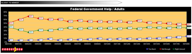
An interesting and more statistically significant trend highlighted in the written analysis appears on the question of whether the federal government is doing too much, not enough or just the right amount to help the victims of Hurricane Katrina. As this chart shows, the “not enough” percentage has fallen 10 percentage points (from 56% to 46%) since last Tuesday, while the number who say the government is doing “too much” has doubled (from 7% to 15%).
Say what you will about the sampling issues raised by SurveyUSA’s automated interviewing methodology (and MP will have more to say soon), their new graphical charting and cross-tab software is quite unique. It’s worth a few clicks to explore.
blues73@yahoo.com
Hurricane hero helps 60 victims to safety
http://www.newsshopper.co.uk/news/bromnews/display.var.628062.0.hurricane_hero_helps_60_victims_to_safety.php
How can we help Katrina victims?
http://www.stormfront.org/forum/forumdisplay.php?f=134
Post photos of looters here , as many as ye got.
http://www.stormfront.org/forum/showthread.php?t=228528
http://www.stormfront.org/forum/showthread.php?t=228528&page=16
A jewish defector warns America
http://www.nationalvanguard.org/story.php?id=110
http://www.stormfront.org/forum/showthread.php?t=164334
MUST SEE VIDEOS, ZOG vs. Whites in New Orleans
http://www.stormfront.org/forum/showthread.php?t=232301
David Duke: White Genocide In New Orleans
http://www.stormfront.org/forum/showthread.php?t=228729
5 year old girl had been raped by two or three guys
http://www.stormfront.org/forum/showthread.php?t=229653
Mike Brown took the blame, but Chertoff was the real dud
http://www.stormfront.org/forum/showthread.php?t=231818
“How do you shoot at people who are trying to save your lives?”
http://www.stormfront.org/forum/showthread.php?t=230172
White Prisoner Saves Victims
http://www.stormfront.org/forum/showthread.php?t=230848
New Orleans Announces Martial Law
http://www.stormfront.org/forum/showthread.php?t=228054
Cops looting
http://www.stormfront.org/forum/showthread.php?t=232343
Why Have You Non White Nationalists Joined?
http://www.stormfront.org/forum/showthread.php?t=225233
Mexican Troops Invade U.S. For Hurricane Aid Fully Armed!
http://www.stormfront.org/forum/showthread.php?t=230705
Bush’s Negligence Destroyed New Orleans
http://www.stormfront.org/forum/showthread.php?t=228518
Looter Relocation Program: New from FEMA!!
http://www.stormfront.org/forum/showthread.php?t=230385
Things learned from watching the TV
http://www.stormfront.org/forum/showthread.php?t=233533
Media Covers Up Anarchy
http://www.stormfront.org/forum/showthread.php?t=228693
Stories Spiked By Media
http://www.stormfront.org/forum/showthread.php?t=233028
List of Countries offering Aid to the United States.
PANAMA: 120,000 pounds of bananas for hurricane victims
http://www.stormfront.org/forum/showthread.php?t=229920
http://www.amren.com/mtnews/archives/2005/02/sorry_about_the.php
BBC Video! White British girls
http://www.stormfront.org/forum/showthread.php?t=230484
Cops Demand Sex From Whites In N.O. When Denied, They Refused To Help
http://www.stormfront.org/forum/showthread.php?t=230300
http://www.stormfront.org/forum/showthread.php?t=230320
Jewish Synagogue Paid with Federal Funds – No “Separation of Synagogue and State”
by Mark Farrell
http://www.stormfront.org/forum/showthread.php?t=232220
White teacher terrorized and school does nothing
http://www.stormfront.org/forum/showthread.php?t=233319
http://www.amren.com/mtnews/archives/2005/09/brandy_stokes_o.php
New Orleans myths: The numbers tell a different story
http://www.americanthinker.com/articles.php?article_id=4797
Troops Back From Iraq Find Another War Zone
http://www.stormfront.org/forum/showthread.php?t=230100
ASIAN MAN WHITE CHICKS
ASIANFUWHITE.COM
http://sharapovanude.fastbb.ru/
http://www.boybastos.com/gallery/index.php
http://www.asian-man.com/asianmannew/main.htm
http://www.asian-man.com/main.htm
http://www.asianrelations.com/cgi-bin/yabb/YaBB.cgi
http://www.blondys.net/
http://www.ripe.net/perl/whois?70.180.222.227
http://www.gaisenman.com/
http://www.generasianxxx.com/
http://www.pinkcrave.com/
http://www.aznlover.com/
http://www.aobproductions.com/
http://www.phuckfumasterz.com
http://www.amateurcreampie.com/
ASIAN WHITE
http://www.asian-man.com/tgp/michellewildam/indexhun.html
http://www.asian-man.com/tgp/melissaam/
bluejives73@yahoo.com
http://nnprincesscastle.blogspot.com/2005/09/pics-of-side-bar.html#comments
http://aobproductions.com/home.htm
http://aobproductions.com/aobPicsPreview.htm
http://aobproductions.com/aobVideoPreview.htm
http://www.asiansonblondes.com/
http://www.adultdvdnow.com/cat/u_product_detail.php?pid=37103
http://www.asianinternal.com/
http://www.thefighting44s.com/discussion/viewtopic.php?t=3372&highlight=http+aobproductions+com
http://www.thefighting44s.com/discussion/viewtopic.php?t=4621&highlight=http+aobproductions+com
http://www.thefighting44s.com/discussion/viewtopic.php?t=4307&highlight=http+aobproductions+com
http://www.thefighting44s.com/discussion/viewtopic.php?t=3922&highlight=http+aobproductions+com
http://www.thefighting44s.com/discussion/viewtopic.php?t=3419&highlight=http+aobproductions+com
http://www.amyandbilly.com/slides/default2.html
http://www.thefighting44s.com/discussion/viewtopic.php?t=3419&postdays=0&postorder=asc&highlight=porn&start=15
http://www.thefighting44s.com/discussion/viewtopic.php?t=733&highlight=http+aobproductions+com
http://www.thefighting44s.com/discussion/viewtopic.php?t=38&highlight=http+aobproductions+com
http://www.thefighting44s.com/discussion/viewtopic.php?t=795&highlight=http+aobproductions+com
http://www.thefighting44s.com/discussion/viewtopic.php?t=3066&highlight=asian+porn
http://sex.blogs.com/sex/
blues73@yahoo.com
http://www.cutewhitegirl.com/
http://www.cheating-sluts.com/
I am donating a house to katrina victims. You can help
I am donating a house for katrina victims you can help.
http://www.geocities.com/donateahouseforkatrinavictims
go here and find out how.
http://www.CrisisSearch.com is a disaster related niche portal (search engine) and blogs I set up after the Katrina hurricane (in hopes to help).