Having linked last week to a graphical representation of the President’s job approval rating, I want to point to another set of graphics that takes Dr. Pollkatz’s graph a step further. The esteemed “R. Chung,” a blogger of sorts who has posted occasionally to MP’s comments section, did some similar charts that label individual pollsters. Chung finds that “some polls do show systematic bias” that he says “can be larger than sampling error. I point these out, because the charts are intriguing and because some of the differences that Chung observes could have more to do with question language and interviewer training than sample bias.
Chung’s charts label each result with the name of the pollster, though he does one thing differently from the Professor Pollkatz chart I pointed to last week. He displays the “spread” (or the arithmetic difference) between the approval and disapproval ratings. In doing so, he identifies a few clear trends: The polls by Fox News were consistently above average (better for Bush) and the polls by the Zogby organization were consistently lower (worse for Bush).
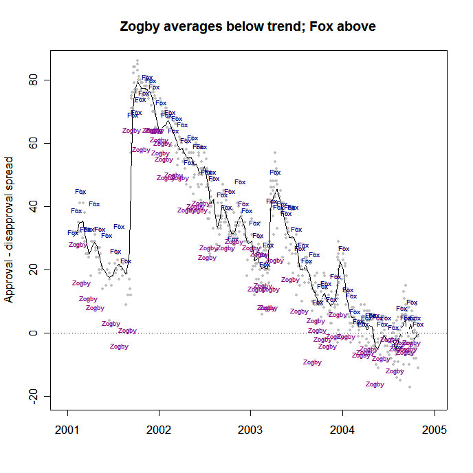
In other graphics and tables, R. Chung also shows that surveys by the Harris organization also tend to show Bush’s job approval spread lower than most other surveys.
Let’s take a closer look.
First, consider the actual text of job approval questions asked by Zogby and Harris (as reported by the Polling Report). Most pollsters ask some version of this question: “Do you approve or disapprove of the way George W. Bush is handling his job as president?” Zogby and Harris ask a different question: “How would you rate the overall job President George W. Bush is doing as president: excellent, pretty good, only fair, or poor?” (Emphasis added – Zogby uses “fair” rather than “only fair”). To get an approval score both pollsters combine the excellent and good/pretty good responses, and to get a disapproval score they combine fair/only fair and poor.
MP can say from experience using both forms of the question that the “excellent, good, fair or poor” categories tend to produce higher “disapproval” percentages. We assume that some respondents hear “fair” as a neutral category indicating neither approval nor disapproval. Look at the Harris and Zogby numbers during 2004 and you will see that they show a consistently higher disapproval, and much lower “don’t know” responses, than other pollsters. Using the numbers reported by the Polling Report, I calculated some quick averages: The average “don’t know” response on surveys conducted during 2004 was less than 1% for Zogby, 1% for Harris and 6% for the other major pollsters (see comment below).
The lower “don’t know” responses that Zogby and Harris get may result from differences in the questionnaire language or from the way they train their interviewers (all the Harris studies used were done by telephone). The Zogby and Harris interviewers may simply push respondents harder for an answer.
Now let’s look at the Fox News surveys. They do several things differently.
First, there is a subtle difference in the language of the Fox job rating question. While most other pollsters ask about “the way George W. Bush is handling his job as president,” Fox asks about “the job George W. Bush is doing as president.” I have no theory as to why this difference would lead to a better score for Bush, the hypothesis would be interesting to test with a controlled experiment.
Second, most of the national pollsters ask the presidential job ratings of the sample frame of all adults. The Fox survey typically interviews only registered voters, and it interviewed only “likely voters” on 5 of 25 surveys. The conventional wisdom holds that the registered voter pool is slightly more Republican (see clarification in the comments section) Democratic, which if true, would produce the opposite effect: If registered voters are more Democratic than all adults, Bush’s ratings should be lower on the Fox surveys, not higher.
(Note: MP presented data showing that samples of likely voters tend to be more Democratic Republican than registered voters, but could not find any analysis of samples of registered voters vs. all adults).
Third, it is also worth noting that much of the difference between Fox and the other polls (excluding Zogby and Harris) during 2004 was in the percentage who expressed disapproval of President Bush. The average approval rating for Fox surveys was 49%, exactly the same as the average of the other national surveys (again, see the explanation/caveats below). The average disapproval for Fox was 43% compared to 46% for the other surveys, with the difference being a higher “don’t know” response for the Fox surveys.
Fourth, there is a possibility of some non-response bias. Perhaps those who approve of President Bush were slightly more likely to participate in a survey sponsored by Fox News than by other organizations. However, for what it’s worth, Chung also charted the presidential trial heat results during 2004, and the Fox Kerry-Bush trial heat results were much closer to average.
Either way, some very elegant graphs raise some intriguing questions.
CLARIFICATION: Lawrence Shiman of Opinion Dynamics
Corporation — the company that conducts the Fox News survey — emails
with the following helpful clarification:
You mentioned the possibility of a non-response bias based on the sponsor of the
poll. In fact, we do not identify the sponsor of the polls [in this case, Fox News] unless specifically
requested, which very rarely occurs. Even if requested, the name of the sponsor
is provided only at the end of the survey, specifically to avoid non-response
bias. At the beginning of each survey, we indicate only that the survey is
being conducted “on behalf of one of the major national television networks.”
Therefore, while there may be valid reasons for the differences in job approval
ratings for the president, it is unlikely to be a result of Fox News being the
sponsor.
—-
Note on averaging: I gathered job approval ratings from 2004 as reported by the Polling Report for: ABC/Washington Post, AP/IPSOS, CBS, Fox, Gallup, Harris (telephone surveys), NBC/Wall Street Journal, Newsweek, Zogby, Pew and Quinnipiac. Although all of those organizations did surveys periodically during 2004, some polled more frequently than others. Also, as noted in the text above, most surveyed all adults, but several surveyed only registered voters or likely voters for some or all surveys. The differences in frequency and sample frames mean the averages are not strictly comparable.
Mark,
Intersting analysis. Maybe you can clear some things for me.
1. I thought LV gets more Republicans into the mix than RV, and RV more than adults. Lot more Dems who don’t vote. If I am right, than Fox should have higher JA.
2. Why do Gallup and other pollsters just do adults? People who are interested in these numbers (politicians, etc.) care mostly about voters.
3. We all know about Zogby, so it doesn’t surprise me that he has negative bias in JA and Bush/Kerry.
4. Lastly, I think the only number that matters is Bush’s support among Republicans. Republicans mainly want to use Bush to raise funds, and Democrats in Red States worry about his popularity there.
Cable Guy:
You wrote
“1. I thought LV gets more Republicans into the mix than RV, and RV more than adults. Lot more Dems who don’t vote. If I am right, than Fox should have higher JA.”
Good catch. You have the conventional wisdom right. I was experiencing what survey methodologists might call a “brain freeze.”
My apologies, and thanks for editing my piece at no charge.
You also wrote:
“2. Why do Gallup and other pollsters just do adults? People who are interested in these numbers (politicians, etc.) care mostly about voters.”
You are right that political strategists care mostly about those who will vote (or those who at least have the *potential* to vote) and thus tend to focus on the pool of registered or “likely” voters.
This may be a “goo-goo” attitude, but I would hope that our leaders would also care about the opinions of all citizens, not just those that voted or that voted for them.
Gallup and the other pollsters that begin with samples of all voters actually “do both” in a way. That is they start with samples of all adults, and report (or at least have the ability to report) results for just registed voters as well.
By completing interivews with a sample of all adults, they have the ability to weight that sample to reliable US Census demographic statistics.
Like you, I suspect, I wish they would do a better job *reporting* results from both registered voters and all voters for questions like the Bush job rating.
Mark, regarding the Gallup using only “all adults,” do you know why it falls back to that category when during the election they used both LV, RV and all adults? Gallup should provide all three sets of numbers.
Secondly, LV or RV is more important because if you don’t take the time and effort to vote, you aren’t that important. If you don’t care, politicians and other decision makers as well as media shouldn’t care that much.
Cableguy:
I won’t try to speak for Gallup, but you might want to try submitting this question to their “Editor’s Blog” at http://www.gallup.com/poll/blog/
It seems to be available without subscription.
My $0.02: I’m wary of Gallup’s use of their likely voter (LV) model several months before the election, much less two years before. However, I tend to agree with you on providing results for registered voters.