The release of new results from six major public pollsters over the last two weeks provides a great opportunity to learn something about both the limitations of survey research and about its power.
Most political surveys are based on random samples of telephone households, which comes with a lot of random variation. As we have seen in two recent posts, very small sample sizes (100 interviews or less) can show huge variation, but even larger samples (500 to 1000 interviews) still show a lot of statistical noise. Remember that the +/-3% “margin of error” on 1000 interviews assumes a 95% confidence level. That means that one survey statistic in twenty will fall outside that [of] range [of the “true” value] by chance alone. And none of this considers the variation that can come from other polling variables: response rates, question language and order, interviewer characteristics and training, pollster persistence in contacting the respondents, techniques used to select respondents and so on.
The bottom line: Political polls come with a lot of random noise. Anyone poll may show a difference of a few points when compared to another that turns out to be completely meaningless. Unfortunately, all too often such variation gets reported as a real trend.
However, the power of such polls is that the more we can increase the size of random samples, and the more we can look at not just one poll but many polls, we can begin to see real trends emerge from all the random noise.
Such is the result of the six polls released in the last two weeks, including one released this morning by Gallup/CNN/USAToday. The table that follows compares results from six national polls released in the last two weeks to the average of results from the same pollsters as measured in September. All six showed the job approval rating of President George W. Bush declining since September.
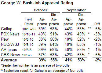
Now, the margin of error allows for the possibility that any one survey might show Bush a little higher or a little lower by chance alone. If perceptions of Bush’s performance had not changed since September, we might expect to see some polls showing him doing better, some doing worse. The mix should be roughly half up, half down, as if we had flipped a coin six times. But in this case all six show a decline. My favorite “binomial calculator” tells me that the probability of flipping a coin six times and having it come up tails each time is only 1.5%. (For more details about the various polls and links, see the PollingReport or RealClearPolitics).
An even better way to separate trends from noise is to draw a picture. Or more specifically, plot a graphic that shows every job approval rating released on a national poll during 2005. Prof. Charles Franklin of Political Arithmetik did just that last week. This is what the picture looks like (the red dots are polls conducted since Katrina);
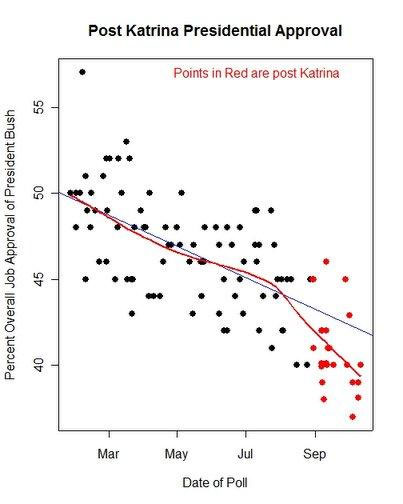
Franklin plotted a regression line through the dots that shows the trend embodied in all the polls after correcting for “house effects” – consistent “differences among polling houses” (as he puts it).** Here is Franklin’s take:
The decline in the President’s approval is clear visually, and the local trend line in red shows how sharply the trend has departed from the blue linear trend for PRE-Katrina polls (Note the close fit of red and blue trends before August.)
The model, corrected for differences among polling houses, now estimates a Katrina effect of -1.2%. Prior to Katrina, approval was falling at a rate of -.03% per day throughout 2005….
The bottom line: the President’s approval has fallen all year, declining about 1% every month since January. But since August we’ve seen a sharper drop. [emphasis added]
In the chart you can literally see the random noise, the roughly 10 percentage point band of dots around the trend line. That is a picture of the limits of survey research. But we can also see a clear, unmistakable trend. So it is also a picture of the power of polling.
**See the non-self-aggrandizing page of R. Chung for some incredible graphics on public pollster house effects.
UPDATE: This afternoon SurveyUSA released it’s monthly 50-state tracking of the Bush job rating. The also compute a weighted overall average with each state weighted to its share of the US population. The result is consistent with the other pollsters: From 41% approve-57% disapprove in September to 38% approve-59% disapprove now.
very informative- you shed light on a lot of things that (i would imagine) most people do not know about public opinion polling.
good stuff , statistically correct.
Thank you for this page.
By putting some of the dots in red and labeling them post-Katrina you are coming close to endorsing a causal theory of the deviation from the prior trend. But the unaided human eye is notorious for overfitting every blip in random data. Without further identifying information, any other event that happened after the start of July up to October could equally well be responsible for the drop.
More evidence that we never elected this guy. A 47 percent approval rating both before and after the 2004 election? Something smells fishy.
Cast your vote for Resident Bush at the Missing P project
http://www.geocities.com/themissingPproject
How does this fit in with the recent (10-21-05) Zogby poll, which showed a bounce in Bush’s approval ratings, apparently due to the ratification of the new Iraqi constitution?